Here I will be posting my progress of this website and other events.
11-08-2018
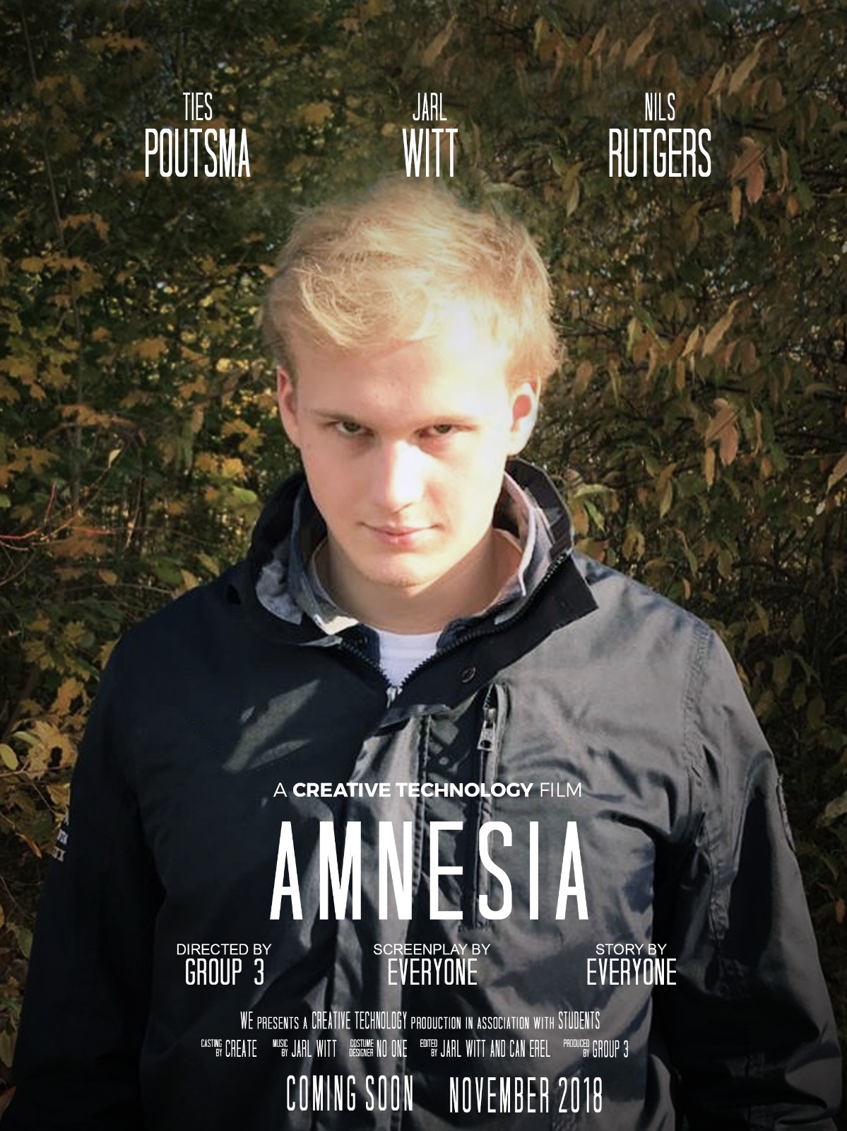
We made an interactive video! It's a story where you wake up and don't know who you are anymore(like amnesia) and depending on where you search in your room for items, you discover who you are. Either a cop who's going to arrest drugs dealers, or the dealer himself.
At the expo, we put up this video so people could watch. Most people were enthousiastic about our video! I also had the chance to check out the other videos as well, and was amazed by the diverse and original things people came up with. I had great fun at the expo!
11-08-2018 (edited 09-12-2018)
I reviewed three websites in total, from Jelise Schokker, Melissa van Schaik and Natasja Schaafsma. (you can visit their site by clicking on their name in white) I've seen three different styles as well and I liked reviewing them. I have also made a comparison chart to see the differences between the sites. You can see the chart on the right side, containing the total score they had, dates of their last posts on their blog, number of portfolio items, number of social connections and whether their site is responsive.
I was mostly impressed with Melissa's website, because she built it herself without a template, and it looks and feels very artistic and original. She also has posts on her site that are not related to Creative Technology, and genuinely interest her. Even though her site isn't perfectly responsive, it feels very personal and professional, so my vote for favourite site definitely goes to hers.
11-08-2018
I recently reviewed another website of a student named Jelise Schokker. The website is made from a Wordpress template, and the theme is "materialis". Javascript was also used. I liked reviewing other people because I learned to have an objective view and so it inspired me for other potential ideas for my website(or another one in the future).
So as an example, let's take the main page. She doesn't use different pages for her portfolio or blog, it's all on one page. She uses a template which is also very standard so there's not much to go on there. I think that she doesn't put enough own input in there. There are photos and here name is on there, but to be honest, it doesn't feel like a personal site. But the whole pro about a template is that you don't have to worry about lay-out and your site always looks good and professional. Still, I'd rather make my own site. here is also a link to her site:
03-10-2018
Over the course of the last few weeks, the design of this site has drastically changed. I went from, well - scroll down to the first post - to what it looks like now. The style is definitely different. From the beginning, I haven't really used stylesheets at all, I just looked at them and found them not to my liking. I wanted to build my own site and make it look professional without the help of a sheet that already exists.
The first thing that I changed was the color of the background. I felt that a black background looked professional; Black also gave a feeling of relaxation when visiting a website. But it is a hard color to work with, because it can get dull or still cheap very quickly. That's why I added in buttons that would become pink when hovered over with the mouse. I wanted some color in there, but mostly the focus was on the images. Making use of borders around text really helps to make it look more professional and clear. The final touch that I added was the border around the body of the website. I really like the color that stands out against the black page. I think that this is what my personal touch is to this website: simple, but effective.
03-10-2018
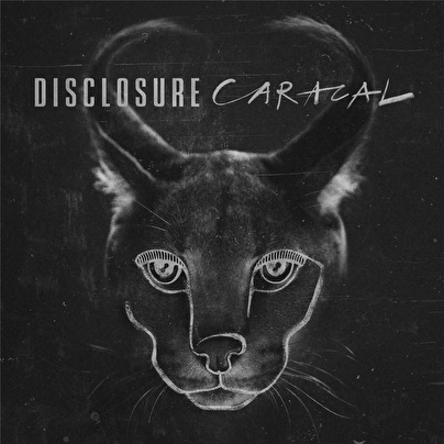
I added another artwork of mine on my blogpage. It's a drawing of the cover of one of my favourite artists at the moment: Disclosure.
I admit, the drawing is nothing special, but I came across it a few days ago and I still like it. I drew this when I was 14, so if you look at it that way, it could've been worse.
26-09-2018
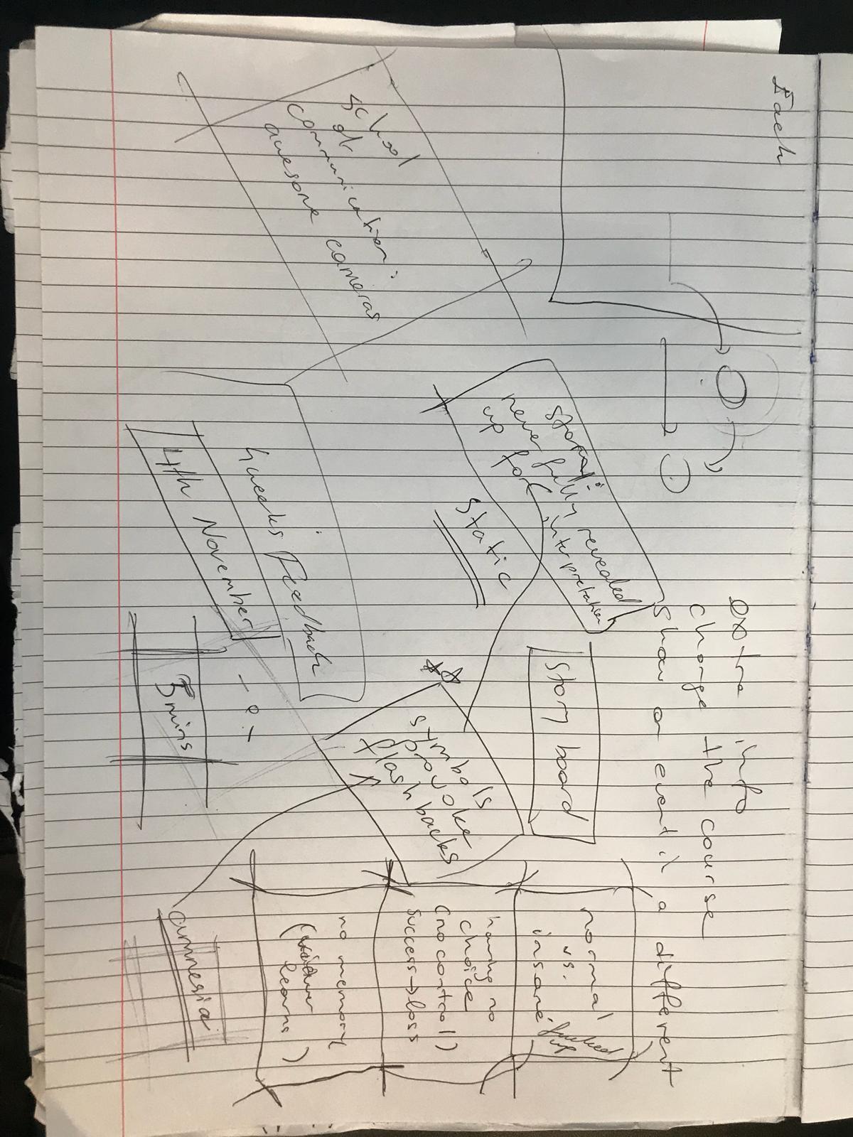
Our video project group came together recently, discussing a little bit about the structure and what the story of our interactive video is going to be about. We wanted to start the story off with a mysterie, for example, waking up on the ground with blood on your face - what happened? We still need to figure out exactly how you make an interactive video, and how the story is going to progress, so we already made a global division of tasks. We also took some notes. They are not very readable, but they are about how the structure of the interactive video should look like.
26-09-2018
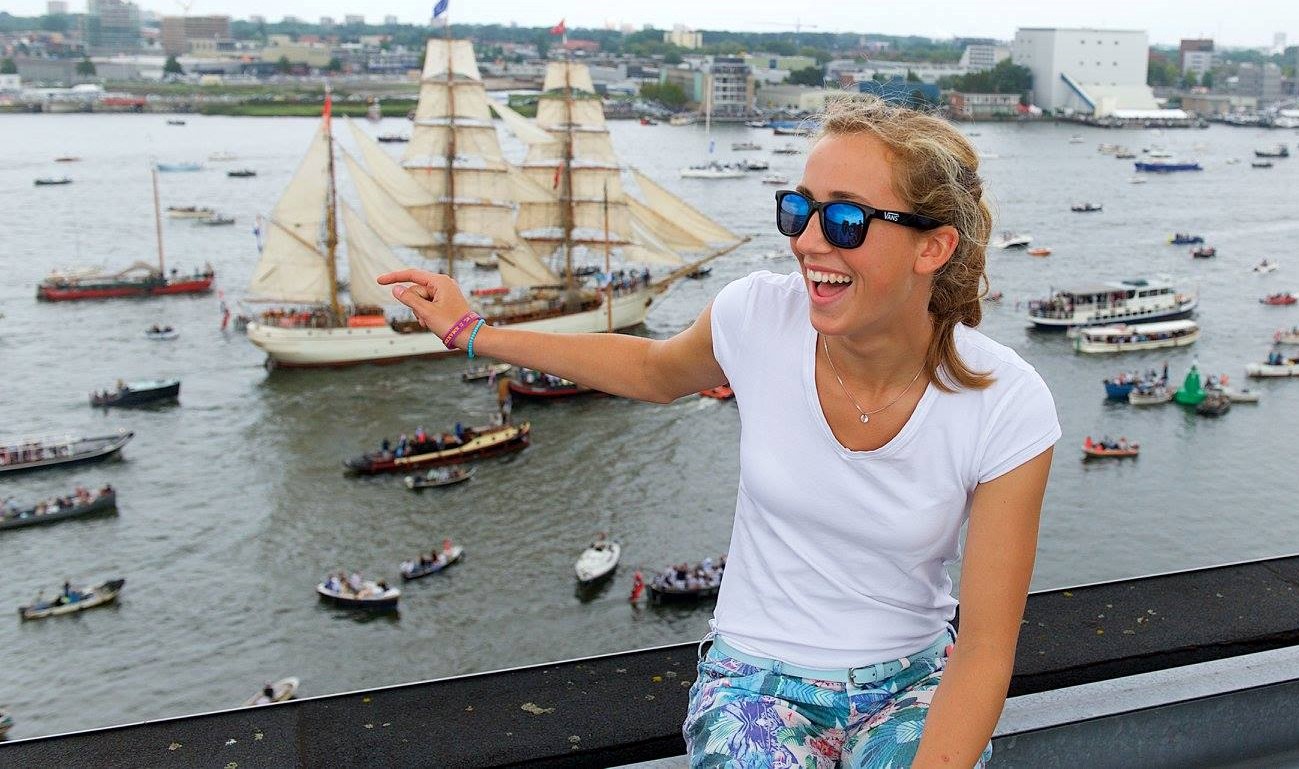
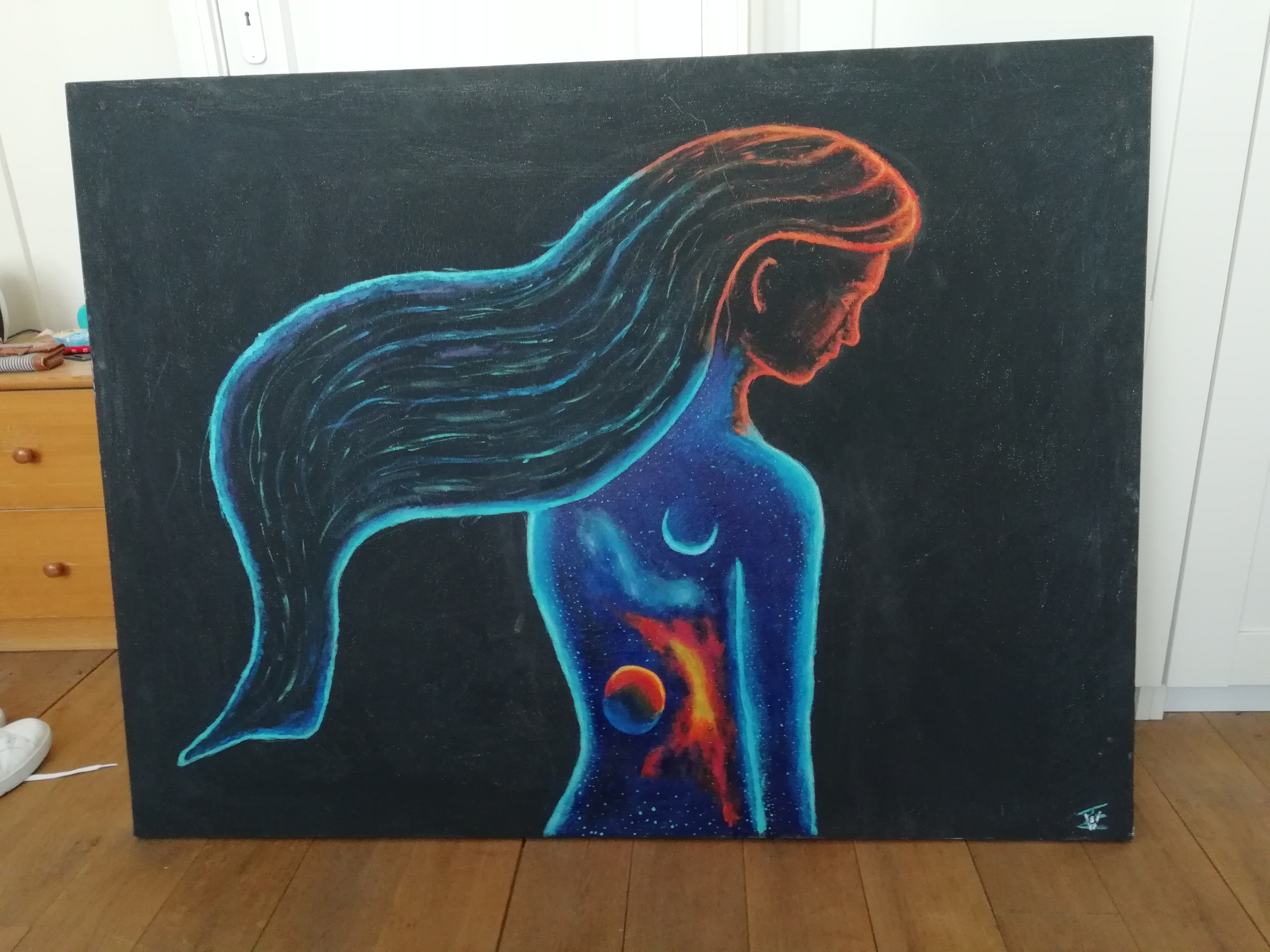
I like painting and drawing like many others. In the first grade of high school, I took part in an art class or get together with other artistic people. The final 'project' was a painting that should represent yourself, but you were free to do what style or pose you wanted. There also had to be a reference to 'The Little Prince' in there.
I was inspired by a photoshoot made by John Poppleton. You can click on the image to look over his website and see where I got my inspiration from.
26-09-2018
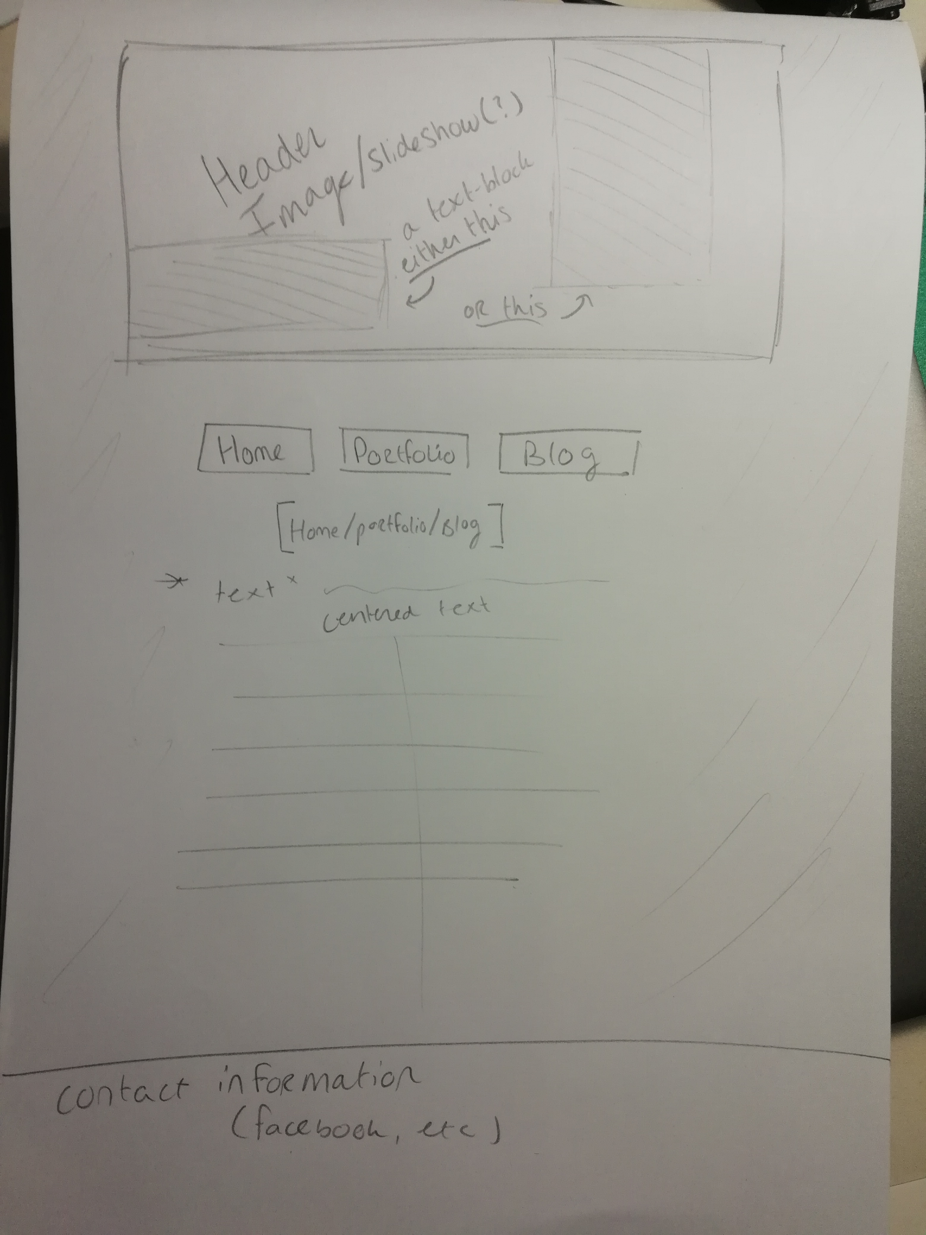
While I am learning, this website changes. I want to show how I would like my site to look like for now. In the picture below you can see the sketch which shows how I want the lay-out to be.
You can (hopefully) see in the picture that I want a header image at the top, then the menu and after that the content of the page. It may not be the most practical, but I think that the site feels more relaxed and professional this way. There's no need to rush onto this site! This way I can also draw attention to the header images. I like simplicity in a site.
On the blog page, I'd still like everything centered, but then when I add text and an image, I'd like the text left from the image, or maybe swapped everytime. This way it seems a little bit easier to read as you're reading from a box rather than randomly floating text.
19-09-2018
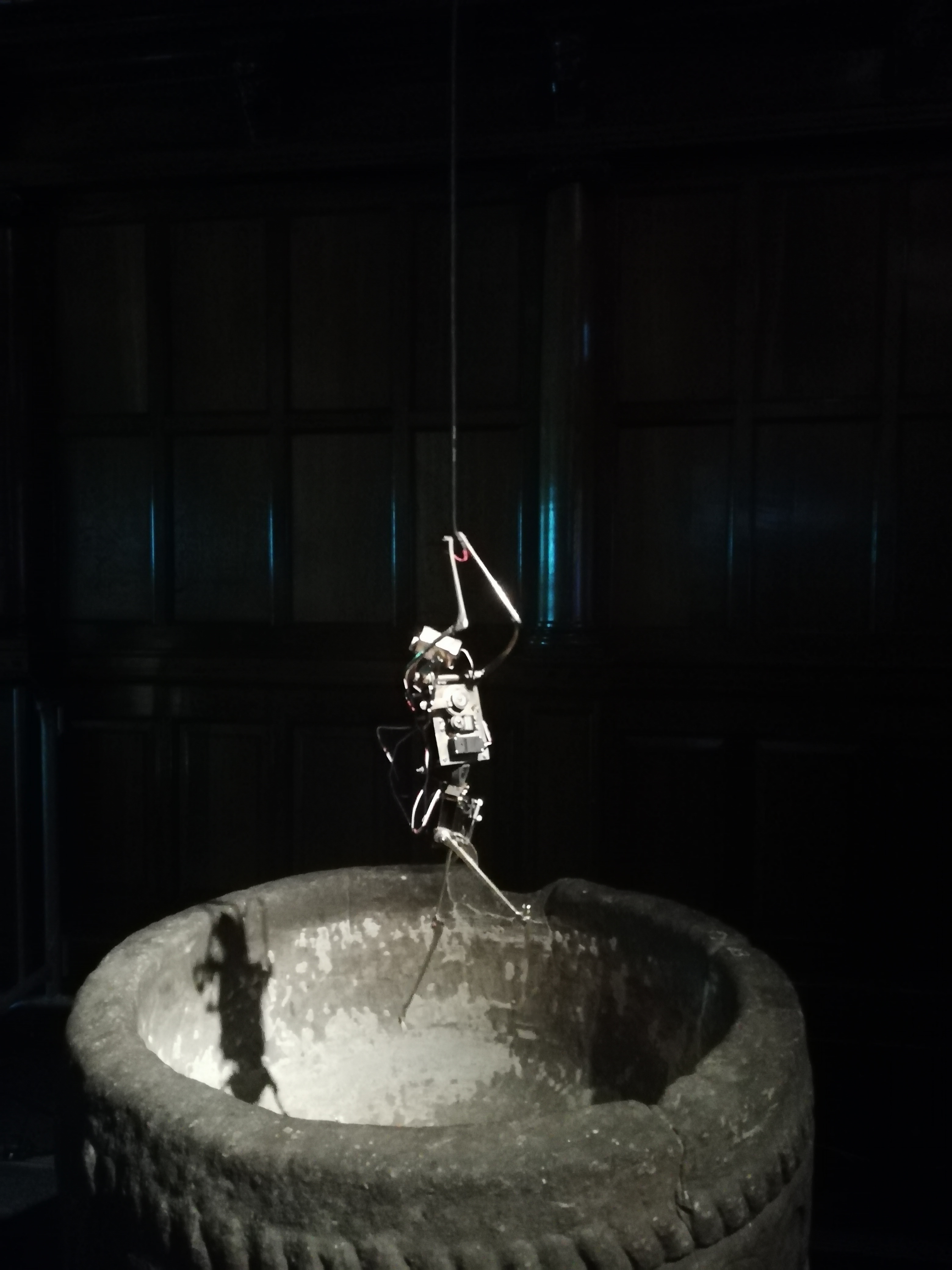
So a while ago I visited the Gogbot festival. It was an exhibition filled with all kinds of technology that had a human touch to it or were interactive. There were many artworks that I liked, this one is one of them.
This particular one I liked the most because even though it is a robot it moves like a human. The artwork is a robot that hangs on a thread attached to the ceiling and the robot is "struggling" to not let go. It was actually a heartwarming thing because it really seems like the robot has an own free will and is desperately trying to keep himself alive, that he actually knows he's in danger. the artist definitely observed the movements and behaviour of humans to mimic the exact actions so that the robot feels like a human.
10-09-2018
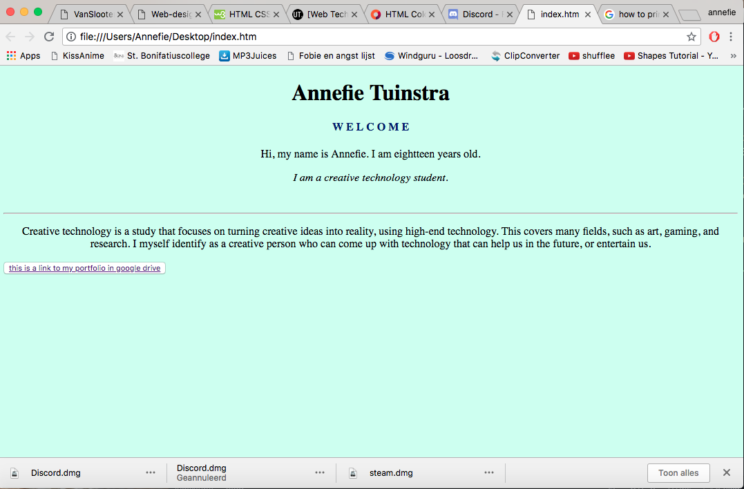
I just wanted to show how I started making this website. In the beginning, it was really empty and looked cheap and like someone spent minimal work on the site(which was obviously the truth)