GogBot visit
2016.09.10
On the 10th of September my friends and I went to visit
the Gogbot festival. We went quite late in the evening
therefore we missed out on most of the activities and thus
I can only review the festival in a limited fashion. Having said
that, the things that I did see, I enjoyed a lot. Especially the
lit up globe in the middle of the church. Excellent idea.
However, the globe installation missed out on a few things
which would have made it a lot nicer. First off, it wasn't
interactive. A lot of people tried touching it to see whther it
had any effect on the pattern generated. It didn't.Missed
opportunity. Then somthing that I missed was that there
was no ambient lighting in the church. Even a very
small amount would have increased the impact
(in my mind at least) as you don't often find a lit up
globe hanging in the middle of the church.Better luck next time.
- Paulius


Website design
2016.09.19
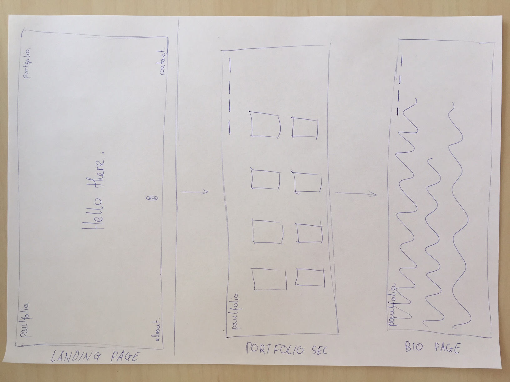
The idea that I have for my portfolio website is that
I want to make it minimalistic. the reason? I think
it does a good job in representing what the type of work
that I like doing and personally it aesthetically pleasing.
In addition, the black on white creates a strong contrast
which draws and maintains attention. The reason
I chose to create a single scrolling portfolio page
was that I think it is more simple and a person
who is looking at the portfolio will have an easier time
find what he needs.
- Paulius
New items to' portfolio
2016.09.27
I have added new items to my portfolio! I would
highly suggest going to have a look. I have
a feeling that you will enjoy the content!
Here is a link to the content. Enjoy.

Design explanation
2016.09.27
The addition to my site was very minimal because I have
more or less finished my desired
layout and now I
just need to fine tune the code and add mobile capabilities.
For this task I added a sticky header which appears after
the navigation method in the landing page is no
longer and visible (and in the blog page after you
scroll past the mouse). I believe this addition allows
for easier navigation of the site as it gives immediate access
to all parts of the website. The text in the nav is relatively
small so as to not distract the user; however, all of the words
are in capitals so as to further aid ease of reading or scanning.
My next step will be to modify the navigation
so that it works on mobile devices.
New items have been added
to the portfolio
2016.10.09
Some new things have appeared in the portfolio! I would
highly suggest going to have a look. I have
a feeling that you will enjoy the content!
Here is a link to the content. Enjoy.
Second design explanation
2016.10.09
This time round, I decided to change the font of "logo" text
located at the top left corner of the websites.
My reasoning for this was that the fonts between the
websites did not match. One was Helvetica Neue and the other was
some other font. The problem with this is that users
visiting the websites may think that they are not related
as the font changes the appeareance of the logo text significantly.
I've changed both logo text fonts to Helvetica Neue.
Peer Review Post
2016.10.19
For task no. 5 I chose to review Yasmilla's website.
The review structure that I will use will be to
review each page and comment on the structure, colours and content. First of,
when we arrive to the website we are greated with a colourful
picture which I think is nice touch which makes the site more personal.
The font colour is also nice since it creates a lot of contrast
and grabs attention. However, there is a lot of free/unused space at
the bottom of the page. Not sure whether this is supposed to be there.
Moving on to the blog. Nice images, with some humour, but yet again
there is a lot of free space at the bottom of the site. The blog posts
were interesting and had some nice images for added interest.
Carrying on towards the portfolio. Very cool Processing sketch with the flies.
I like how it is actually moving and not just a screenshot of it.
Sadly the "about" page was not found. Oh well...
Final video project and review
2016.10.04
First off, here is the link to the final project:
The reason I'm not posting it in the main page
is that I will be completely remaking my portfolio website
and feel that embedding for the sake of embedding
is at this stage is pointless. The current link directs to a partner's website
where you can view the final project. Now
lets talk about the final expo. Overall it was a fun experience
yet there were a few things that could be done better.
For example, the participants were told to come 2 hours before
the start of the event even though, the setting-up
took around 1 hour and the remaining hour was spent doing nothing.
Secondly, the duration of the event was too long. Everyone looked to have had enough
by around 16:00, so maybe its better to make a more "concentrated" event
and save the hour for cleaning up. But I'm focusing on the negatives...
It was super fun being there, listening to music,
eating cake, watching all of the videos and discussing the various choices
made within the movies.