Blog

Final expo
7-11-18
The final expo was fun. All the different projects and posters were really interesting to see. The many different things that people did with the assignment was really refreshing and many times humoristic. Besides the assignment it was also just fun to hang around with the rest of the students and talk about there projects. The most of the time the story behind the poster or the project is more interesting than the poster or the project itself. I had a lot of fun making my own project. There was always a lot of humor, during filming and especially during the meetings. This made it fun to work on the project. A minor incident was that one of our group member did nothing and did not respond to any of our test messages. When you click the button belom you will be linked to an eternal webpage on which the video can be found. Want to see it?


Photo with blog post

Review 2
25-10-18
I reviewed three website an in my opinion they were all good looking. All three of them had some minor aspect in there website that can be improved but the main part was always wel written and good looking. All three of them had a comment from me for the placing/working of the navigationbar. The aspect I liked the most from the first review was the layout of his portfolio page, this looked very neat and gave it an awesome effect. The second I reviewed was in my opinion the best of the three, this is because this website had the best design and the website was one thing, everything matched. It worked at is was supposed to be an was very simple. The third website had a design that was good but it didn't hit me, this was mainly because there was a lot of pink and I don't really like that color. But the rest of the site was put together very well.

If tested the sites on mobile as well. The first site has an intro that does not fit the mobile screen and his division on the home page are messed up. The portfolio page works better but his nice hoover function does not work on mobile but you can acces everything so that's no problem. The background of the second site takes a little long to load but you can access every subsite. The background on the subpages does not really fit and in the portfolio one item only fits like 10%. The site works on mobile but the design does not. The third site is probably the best on mobile from the three apart from the about page everything is readable although not perfect. The only problem is that the pictures are given a pixel with and not a percentage, now the pictures do not fit the screen.

What Tim Feline Rosalie
Title: Portfolio - Tim Yeung Feline Waardenburg Rosalie
Over-all score: 3,4 3,4 3,6
Date of last post: 17-10-18 16-10-18 17-10-18
Number of portfolio items: 3 2 3
Social media connections: Instagram and Facebook None Instagram
Mobile functions: Doable Doable Sufficient


Review
17-10-18
The website I reviewed was very well build, there were a couple of minor inconveniences but those are easy to fix. The maker of the website has some real website making skills. Which you could see in the sliding and build of the portfoliopage, I liked that page the most. When you enter his page there was a nice animation that welcomed you to his site, although it took a bit long after you saw it for the third time. I saw some new ideas and function I could add in a later stage on his site. Like sliding windows and design options for my links and contact function. If you analyse his portfolio page, you see the nice sliding window function to get a little more information about the picture and if you click you go to a seperate page where you can find all the information regarding that portfolio piece. He does this by adding a hoover function to his picture, adding a specific height to the box and using overflow hidden. When you hoover over the picture the picture wil regard a new piece of stylesheet which makes sure the text is displayed underneath the picture, this is nicely done by using a transition-duration of two seconds.

Want to check out his site and see for yourself? Visit it now!


Personal Design touch
3-10-18
My personal touch with this website is the whole website, I bould this website from nothing and every aspect and positioning of the objects in my website I programmed myself. I created a lot of divisions to have exact control over every object, this way it's nice for positioning but my code became unclear. Especially my stylesheet, this lesson I cleaned up my code because the experts told me like 50% of my stylesheet was unnecessary. Some of my style choices: The brown background of my blog posts makes sure that my blogpost are readable and don't get cleared out by the light of the background. I changed the font size and font family from the text to create a nicer and more welcoming view of my website.


Second portfolio piece
2-10-18
I uploaded my second portfolio piece, it is a little java written sun wich can change into the moon. More info.


Video project progress 1
25-09-18
We had a meeting last week Tuesday and today, in these meetings we discussed who should do what. So we appointed a chairman, secretary, scriptwriter, editor etc. In the same meeting we came up with a couple ideas for our movie. Today we had a small short meeting because only 2 of us could attend. So we scheduled another meeting for Thursday. The other thing we did today was choose an idea and started to work it out a little.


My first javascript game
19-09-18
After the web design class I had an workshop about Javascript, in this workshop we had to make a game in javascript. The game that I made is in the subpage portfolio. The game is a invisible maze, you can control the ball with your mouse and move it forward with pressing the mouse. If you choose the wrong path the ball will immediately go back to its first place and you have to start over. The game


Stylesheet internal to external
19-09-18
Today I made my internal stylesheet an external stylesheet to create more order in my code. I had some difficulties with making my stylesheet and that was the reason I didn’t had as much progress with my website as I would have liked. Also I am trying to build my website in only html and css and do not use wordpress or any other template. I know that this will make my life more difficult but I think I can learn the most of that. The photo on the right explains my whole web design experience, you try, you fail, you try, it does something weird, you ask, you succeed.


Photo with blog post


The first lesson
12-09-18
I never programmed in any language before and certainly not in html and css. I had heard of html before but I had never heard of css before. When I started to write the code for my website I had a lot of help from the TA’s and my neighbour who had experience in html. With his help I created my first webpage with some text and a picture. I liked to build the website because you could immediately see the change from your code in the website although it was very precise.


Gogbot festival
06-09-18
The best installation:

The installation I liked the most is Binary Brains, this is one of the projects created by CreaTe students. Binary brains is about the influence people have on each other when they talk about a subject in a particular emotion. In Binary Brains you could really see the influence the brains had on each other. When the brains with the happy and passionate emotion talked with the angry brain you could see the change from angry to happy in the angry brain, there was also a downside to this because when the sad and angry brain talked to the happy brain the happy brain would turn sad. In the intro was a bit long but made it more fun to listen to and made a clear picture of the situation. This system really showed that we as humans have a big effect on other people and that the way we behave does influence other people. This made me aware that I should watch how I speak about certain things to other people. I was really surprised how aware this project made my about this influence that I can have. Besides the nice thought and influence the installation also had a nice look. The wooden structure was nicely disguised in the surroundings. The brains where inside a see through bulb, in the intro these bulbs where filled with smoke. There was also smoke in the bulbs when you turned all the brains into a sad or angry emotion. Furthermore there where a lot of led strips that told you which brain was participating in the conversation and which emotion they had. The switch board they made was functional and neat but wasn’t outstanding in beauty. All with all this installation was for me the most influencing and best executed installation at the gogbot festival.
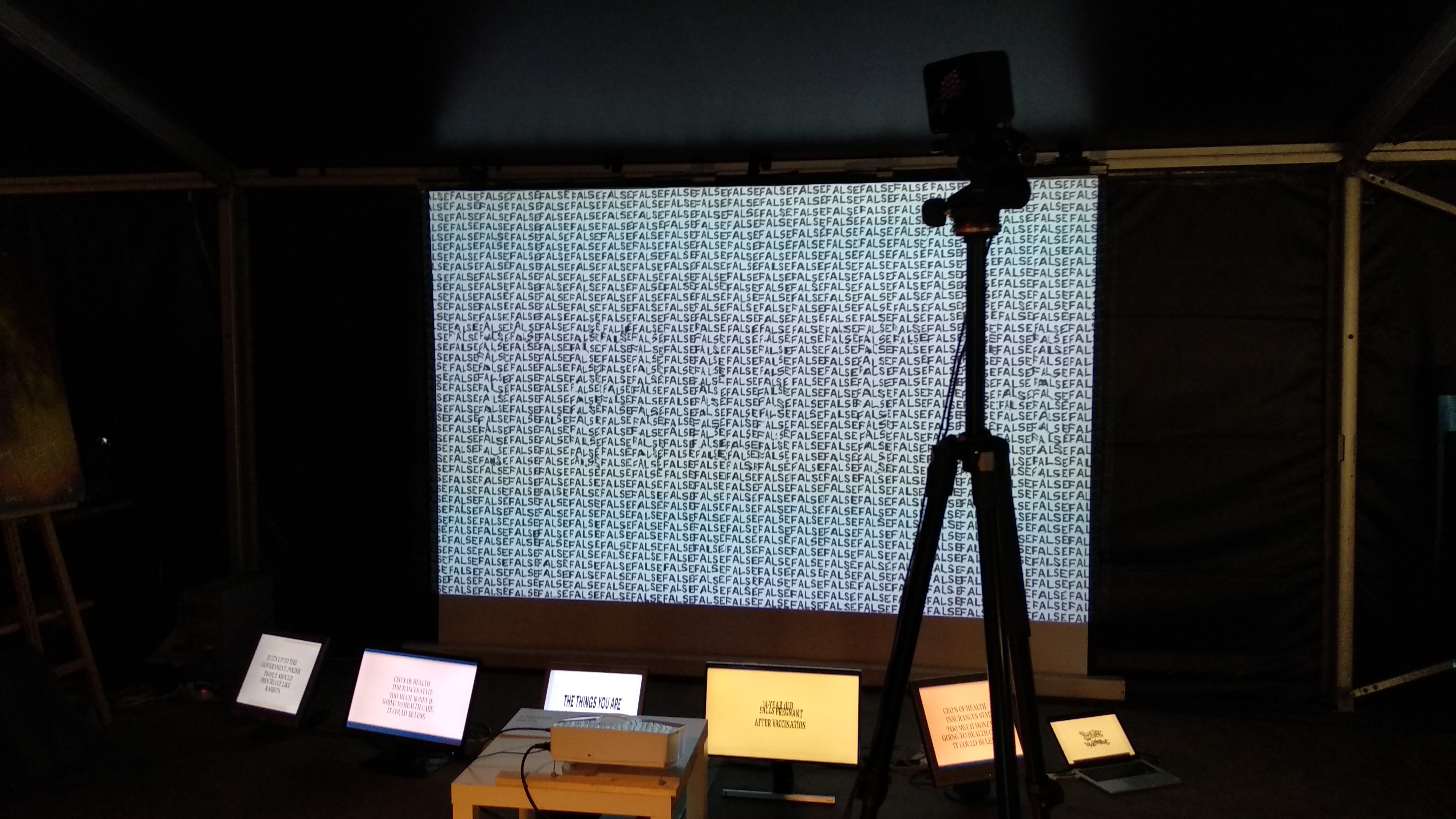
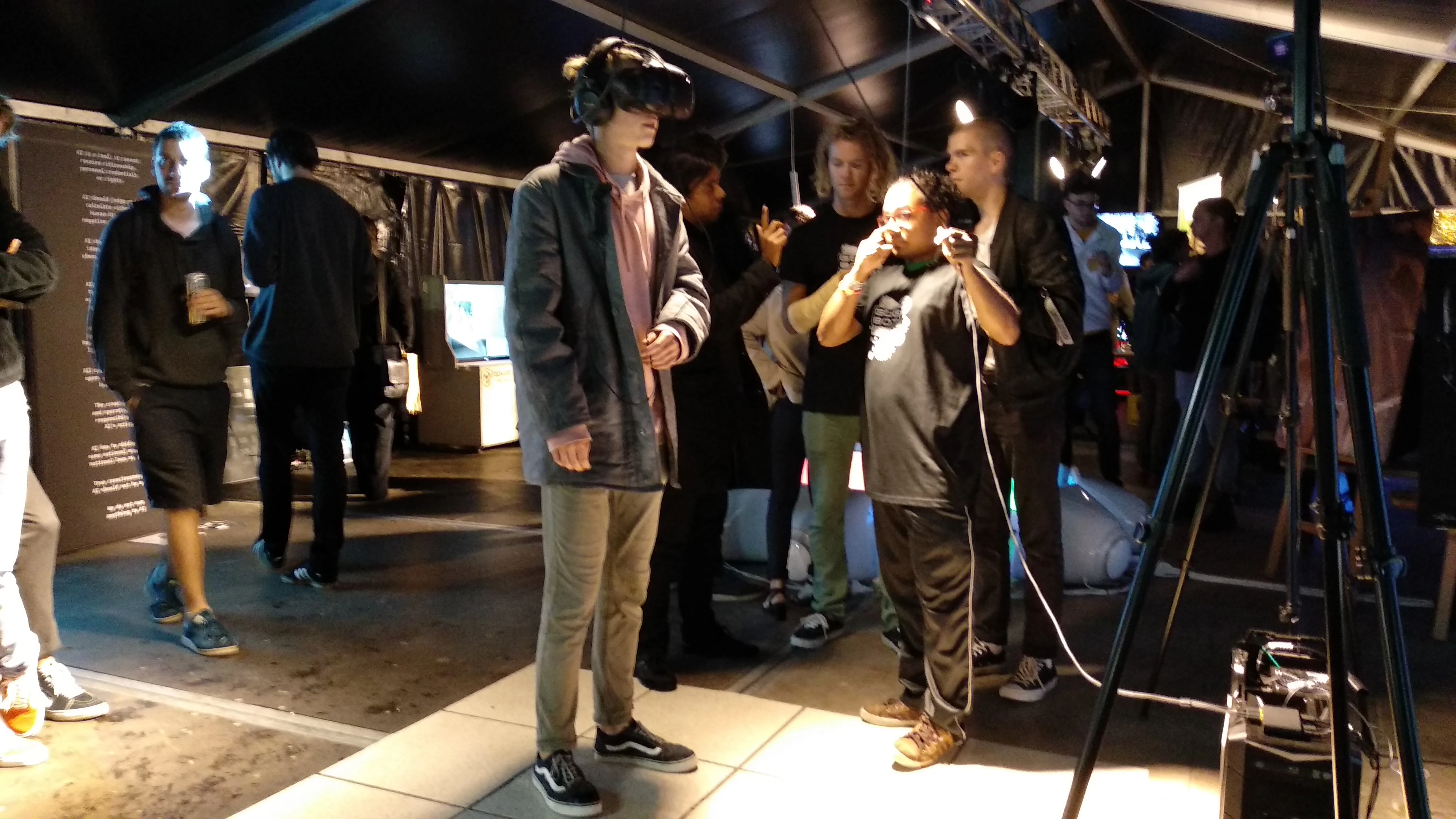
The installation that irritated me the most:
The installation that irritated me the most could be found in the church. In the church most installation where calm, didn’t make any noise and where black and white. But there was one installation about anime and manga, it was very big, noisy and had all kind of colours. It was totally out of form in comparison with the other projects. That was one of the things that irritated me very much. Another thing that irritated me was that in contrary to the other installations there was no story behind this installation. When I read the sign it only said that it was a mix of Japanese manga, anime, online gaming culture, sci-fi, neuroscience and religion. But when I looked at the big screens from 15 meters wide I could only recognize some figures and a lot of busy colours that jumped everywhere. This irritated me because it was very distracting and because the screens where so wide there was know way to see the whole story or meaning of the installation if it was even there.


Photo with blog postPhoto with blog post