
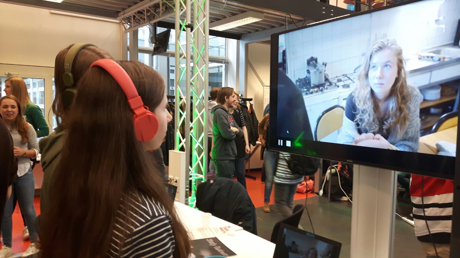
written on: 9 November 2017
by: Charlotte van Doorn
The End Exhibition went alright. We were very smart to bring multiple headphones and a splitter. We tried to show the video to as many as possible people. Unfortunately we didn't win. One thing we could have done, was lay done a piece of paper for people to write their tips and tops on.
Click here to see the video.
written on: 17 October 2017
by: Charlotte van Doorn
For web technology, we had to review the website of our 'peers'. I had to review the
website of my friend Anne van den Biggelaar.
From reviewing her website, I learned that it is hard to make a website on your own from scratch, but it
also is a very cool challenge and I feel inspired to make more on my own. I also like the simplicity of her
website and would like to add that to my website slightly more. However, it is confusing if certain things do
not work, and I hope that that is not the case in my website.
When I went searching for which tool is used, I couln't find any meta data. I guess since she made it from
scratch, that she doesn't have any. At her portfolio page, she has no gallery. However, it does use Javascript,
but I am not entirely sure for what, since it isn't as clear to me. She uses this categories in which the pictures
can be sorted, but it doesn't work yet. I think that is because she didn't properly give them the right names, so
that the program knows how to sort.
Furthermore, I like that she has very short pages. You can almost see all the info of a page without
scrolling down. This in contrary to my page, where you have a very long page.
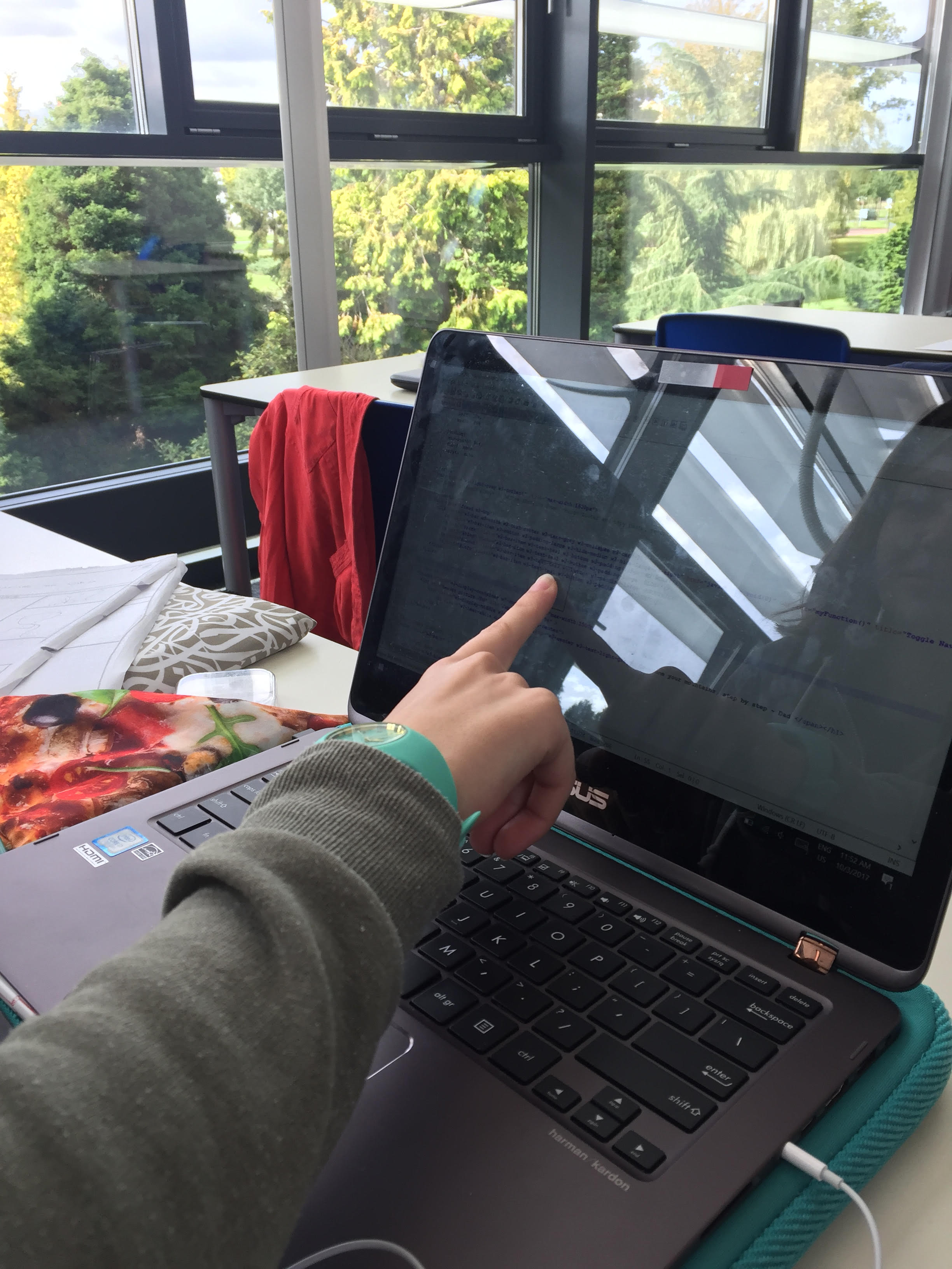
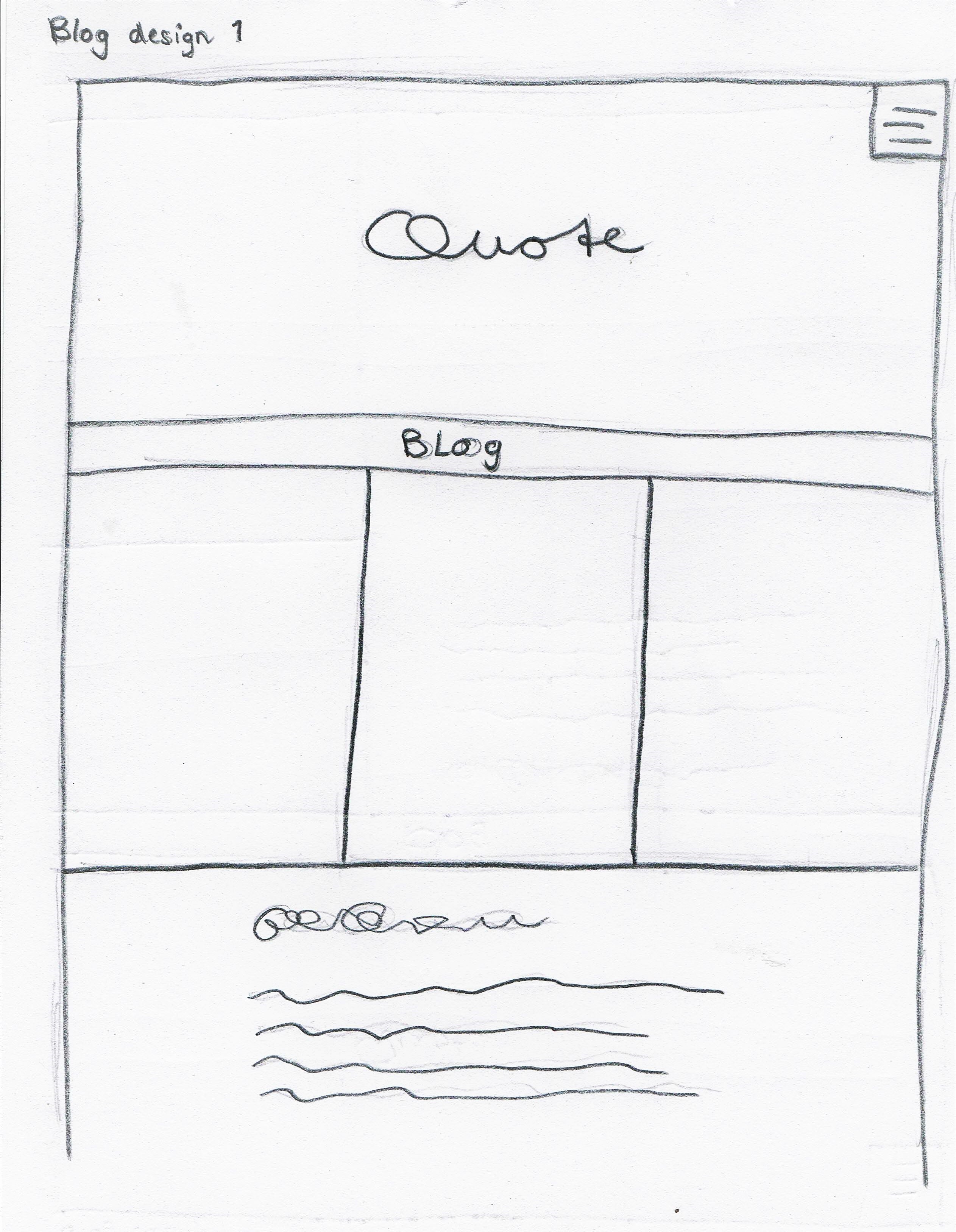
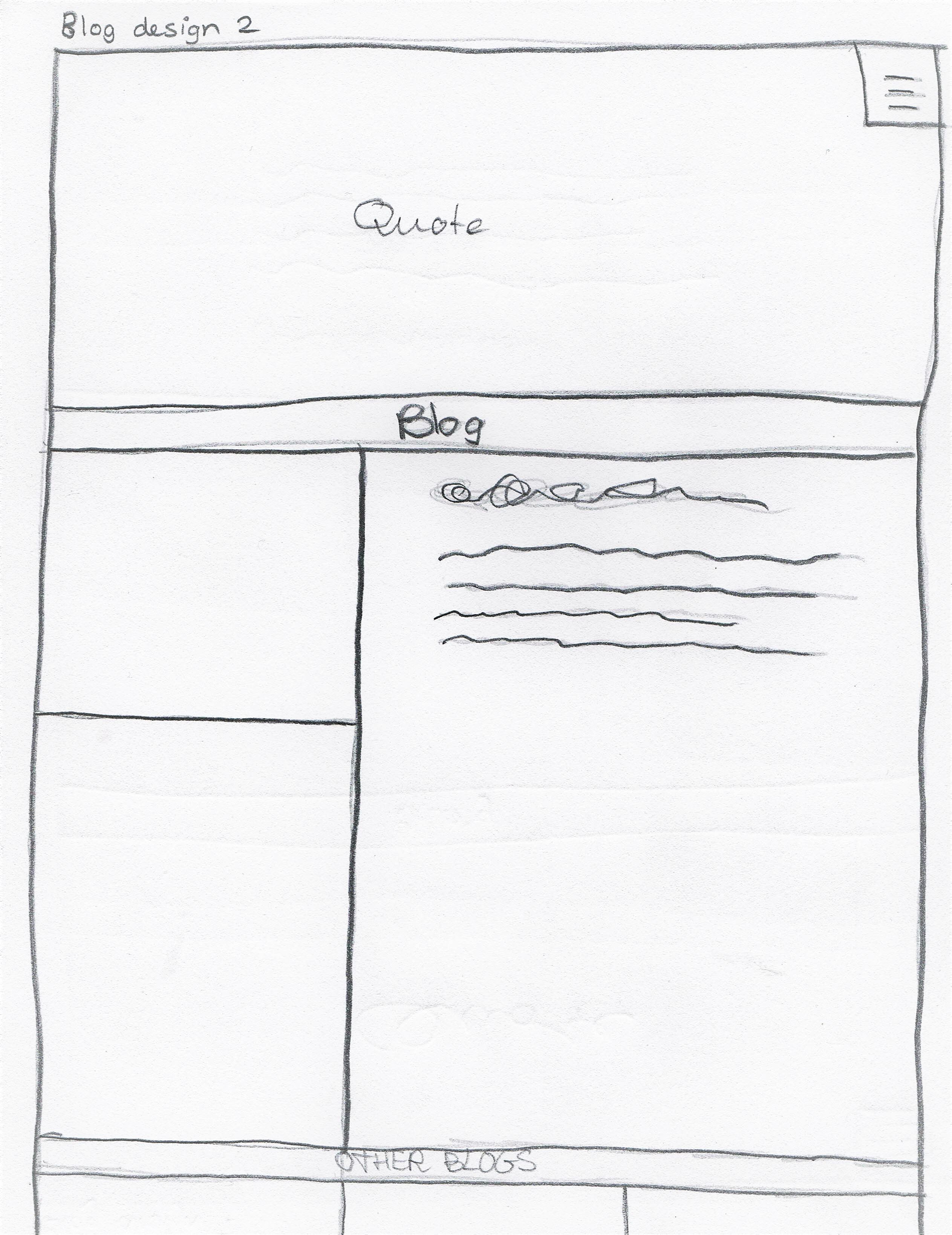
written on: 3 October 2017
by: Charlotte van Doorn
The base of my website are w3s templates, I took several parts of different templates and put them together,
according to my first sketches. It looked good, but I still wasn't fully satisfied.
Last week, I completely disliked my website, wanted to delete it all and start again from scratch. After
several encouraging speeches of friends, I didn't delete it all but started figuring out what it was that I disliked.
I found the website too growded, dark and stressing. I closed my computer and started sketching again in my
dummie (blank paper). Then I came up with this design. Some white space on the side, for which I made my own class.
Between the pictures, there is also some white space, which I made by searching in the standard stylesheet of one
of the templates. The original template, displayed the pictures in three equally big rows (w3-third), in the stylesheet
I found out that I could also use w3-quarter, w3-half and w3-col. This made it possible to show it a bit more
playful. I now also use these different rows to show the blogs more as I want. Four pictures next to each other,
and text above or below. One picture and the text next to it.
In the stylesheet, I also found colors like the color teal, I adapted this to the navbar and the headers of
each item to make it slightly more colorful and more personal.
I still would like to change many things, to make the site better and more personal. I will do this in
the coming time and during my Professional Development Challenges.
written on: 1 October 2017
by: Charlotte van Doorn
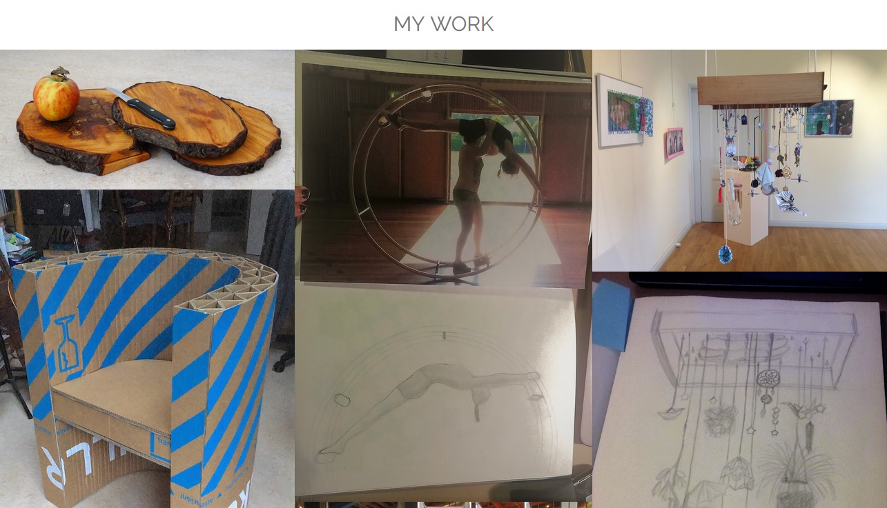
Every now and then I will add new posts and pictures to my portfolio, which can be seen in my work at the homepage.
I am still busy eleborating the abilities my website has, so some things might work and other not. Same with the pictures
in my work, some might have information and other not. I recently slightly changed the lay out of my webpage, therefore
there is another picture showing My Work.
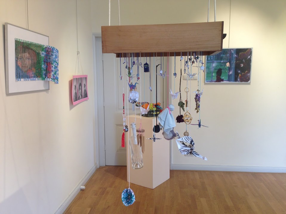
The second picture that has some background information is the picture of the hanging drawer with figures hanging on coards.
If you want to know more about the art work, you can click on this image.
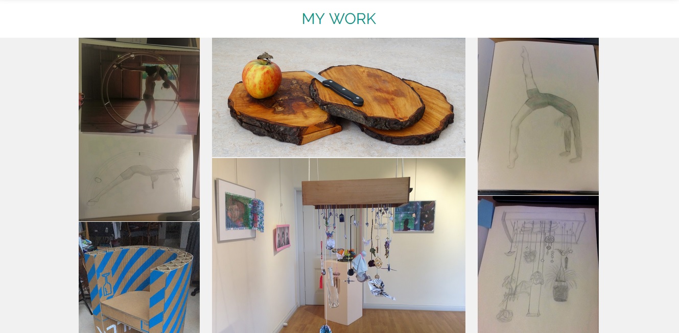
written on: 25 September 2017
by: Charlotte van Doorn
Every now and then I will add new posts and pictures to my portfolio, which can be seen in my work at the homepage.
I am still busy eleborating the abilities my website has, so some things might work and other not. Same with the pictures
in my work, some might have information and other not.
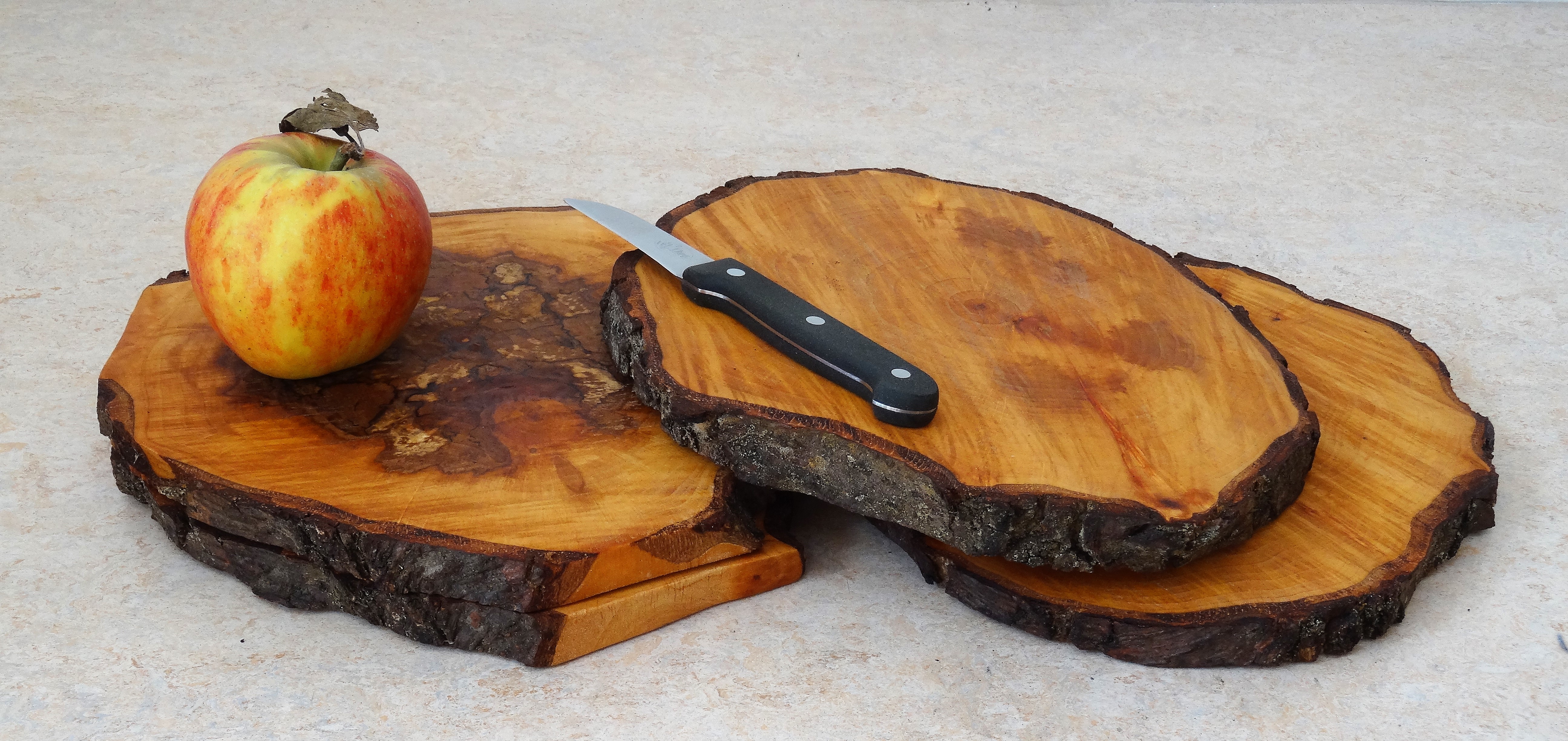
The first picture that has some background information is the picture with the apple on the wooden cutting boards.
If you want to know more about this work of art, click on this image.
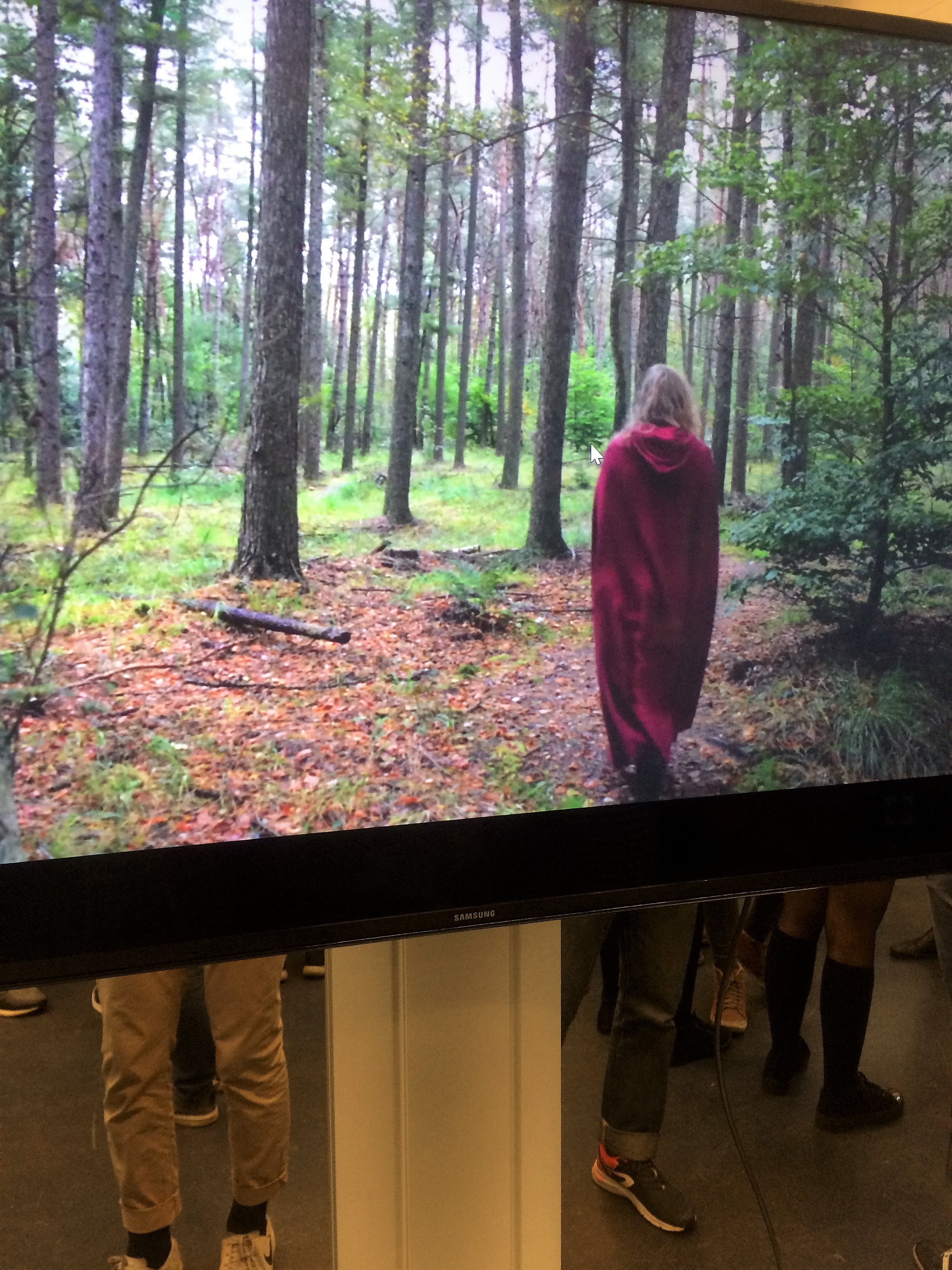
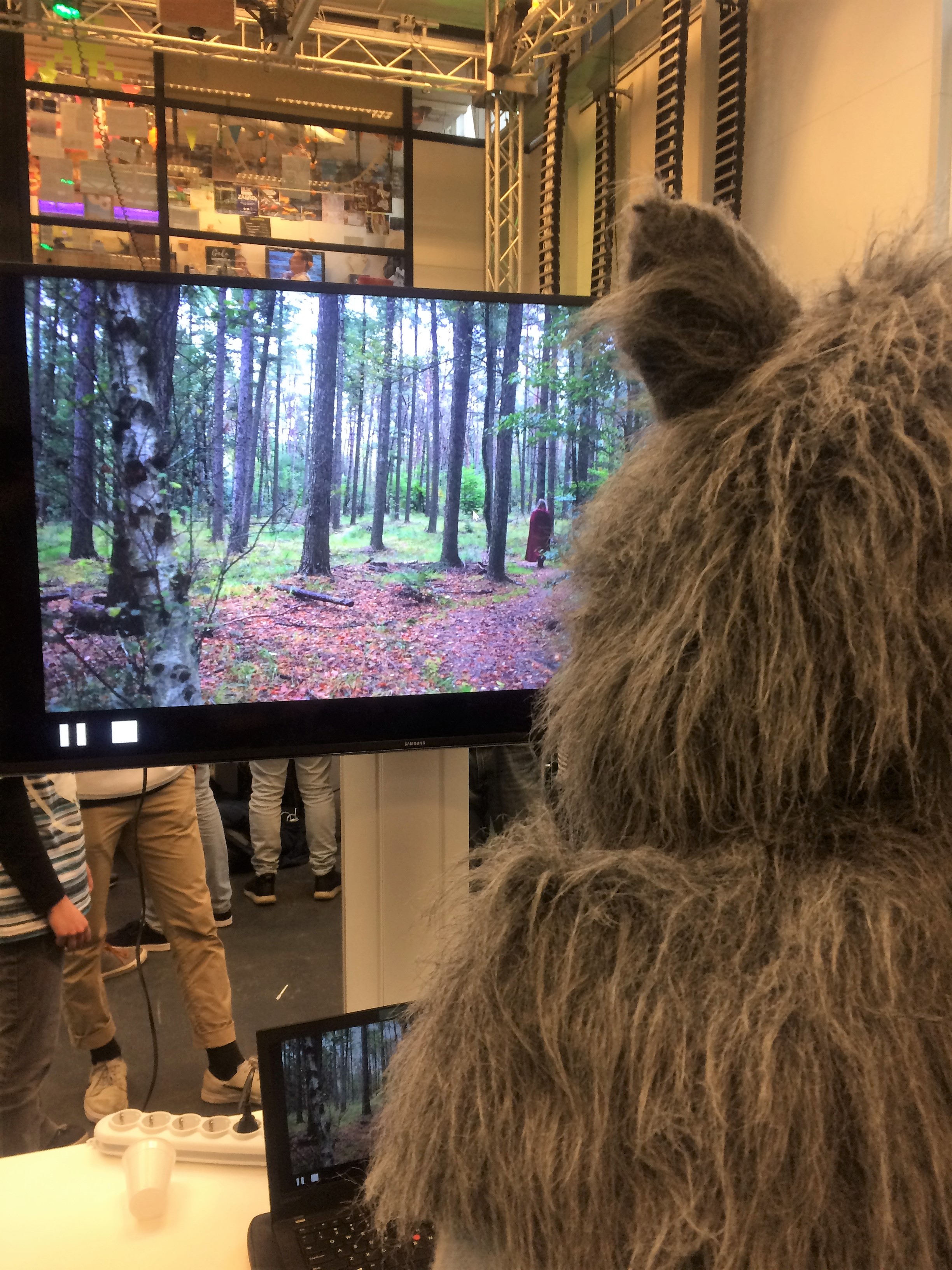
written on: 15 September 2017
by: Charlotte van Doorn
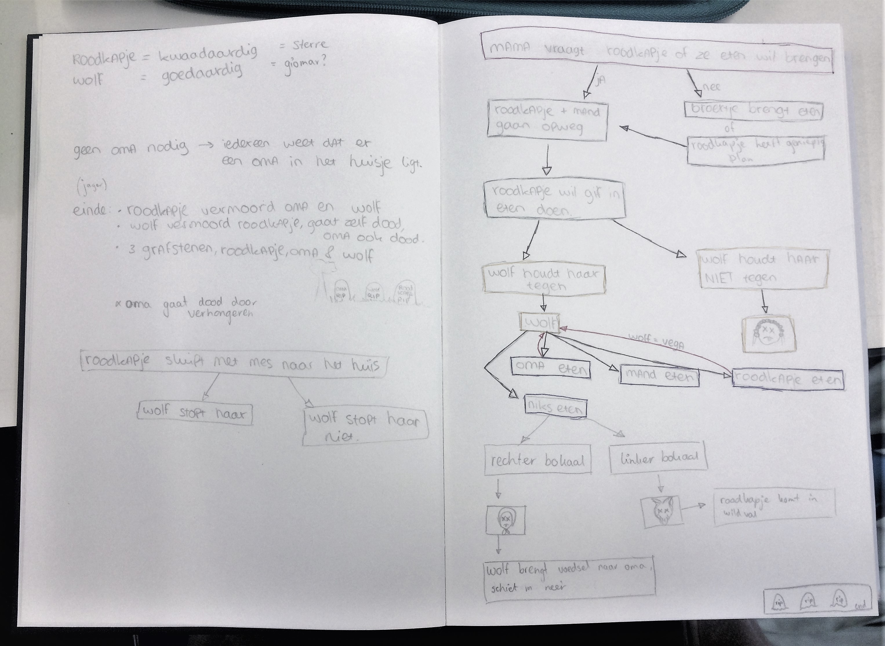
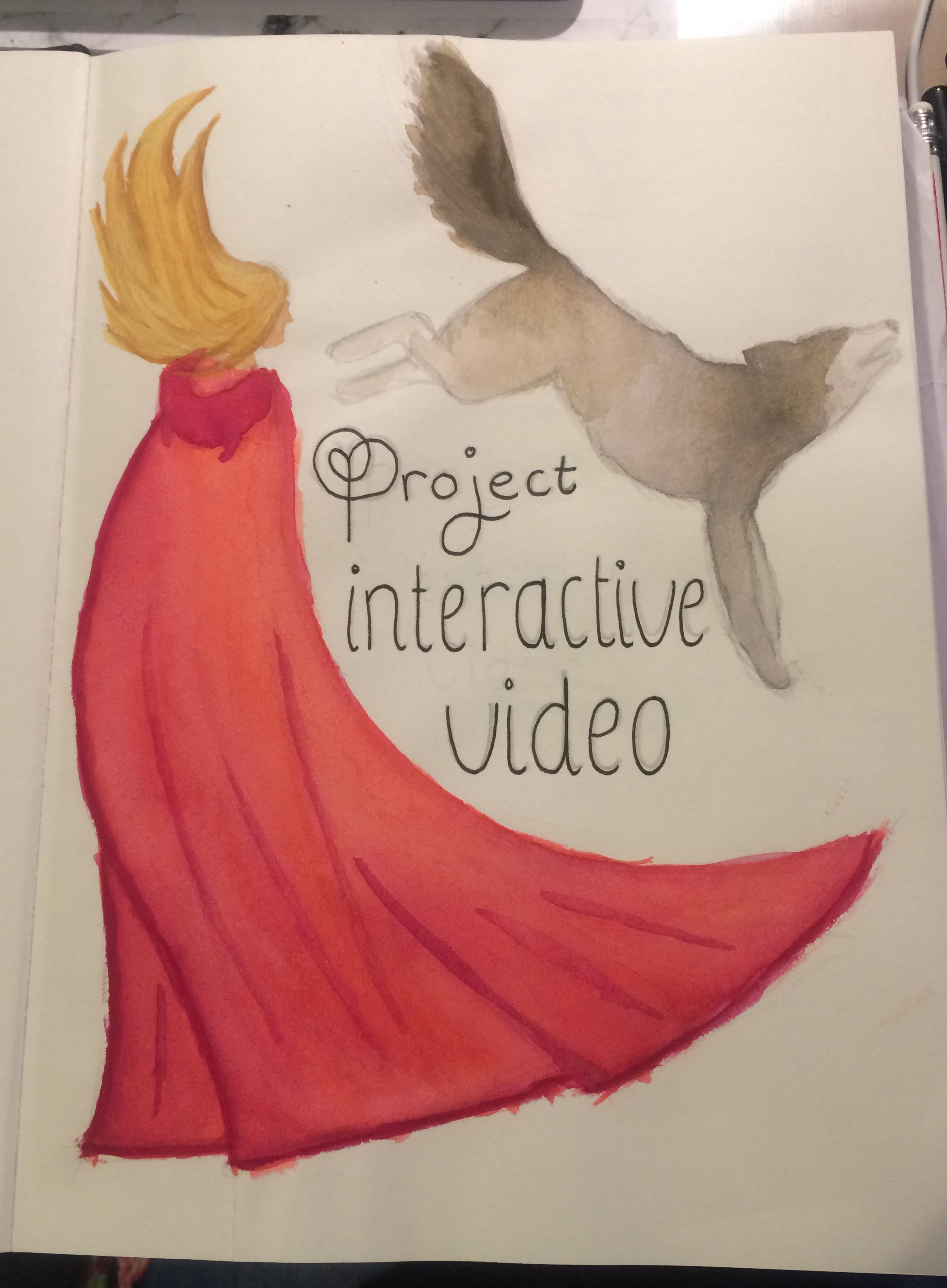
For our very first project of the study CreaTe and the first module We CreaTe Identity, we have to make an interactive video. In an interactive video the viewers have a choice what will happen next. We started by brainstorming and pitching random ideas. After that we started to select the ideas we liked most, and tried to combine them. Of the story we liked most, we made a sketch that the interactive parts with the choices was clear.
Here you see the first parts of the storyboard. For now we only have the main part drawn, with the types of shots, and several little parts about which we don't know yet where they will end up in the story.
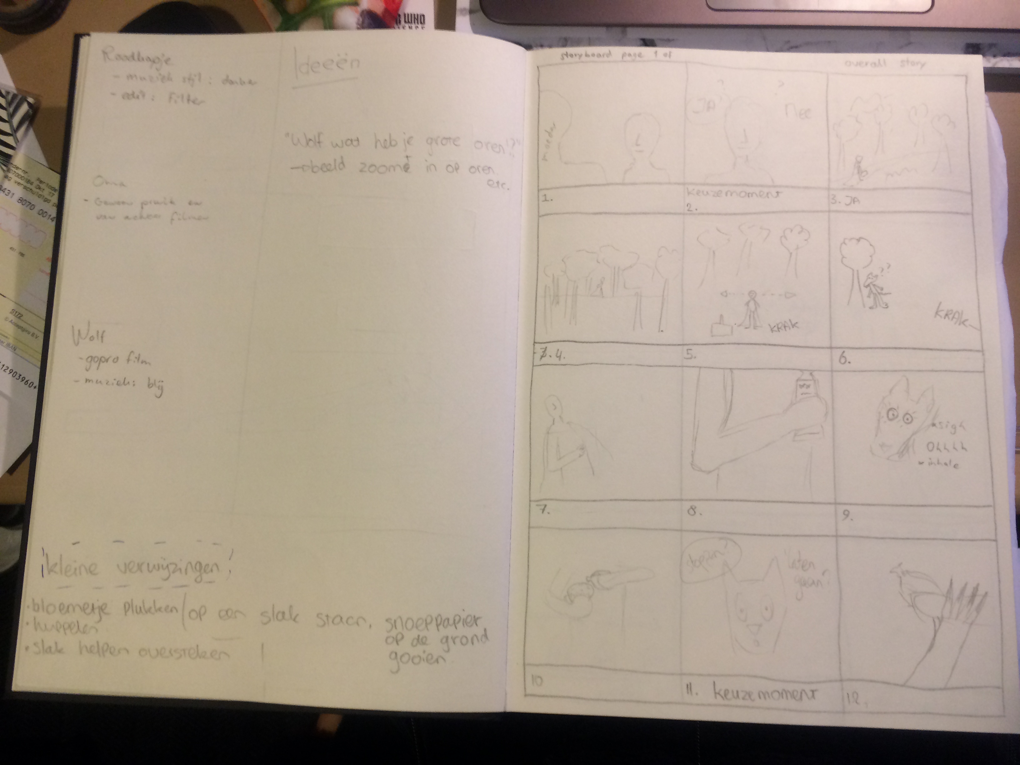
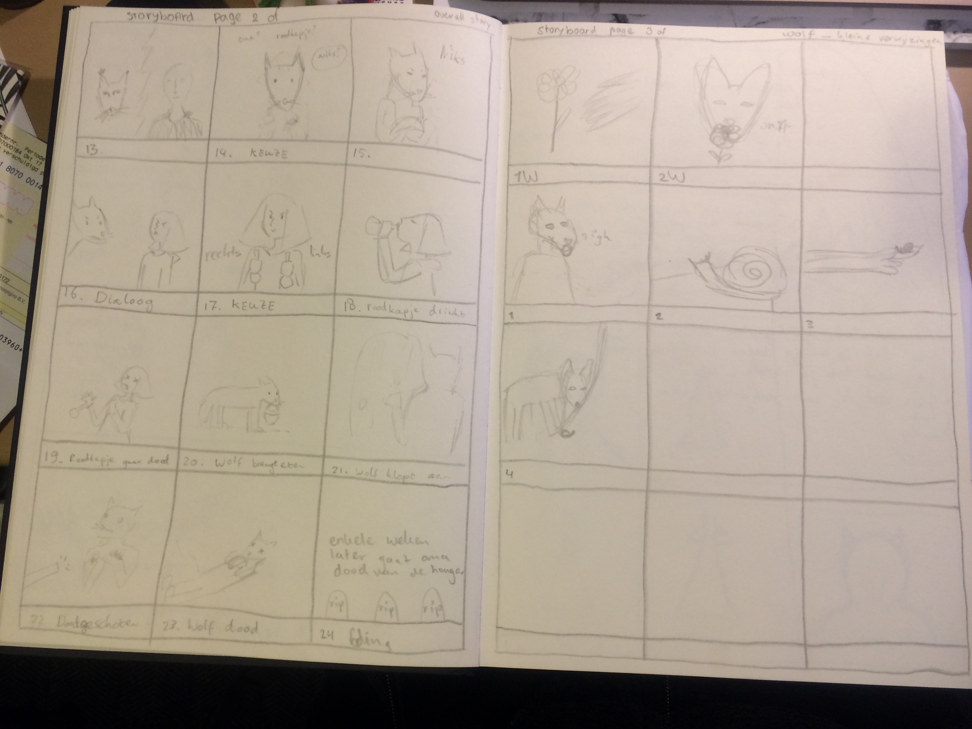
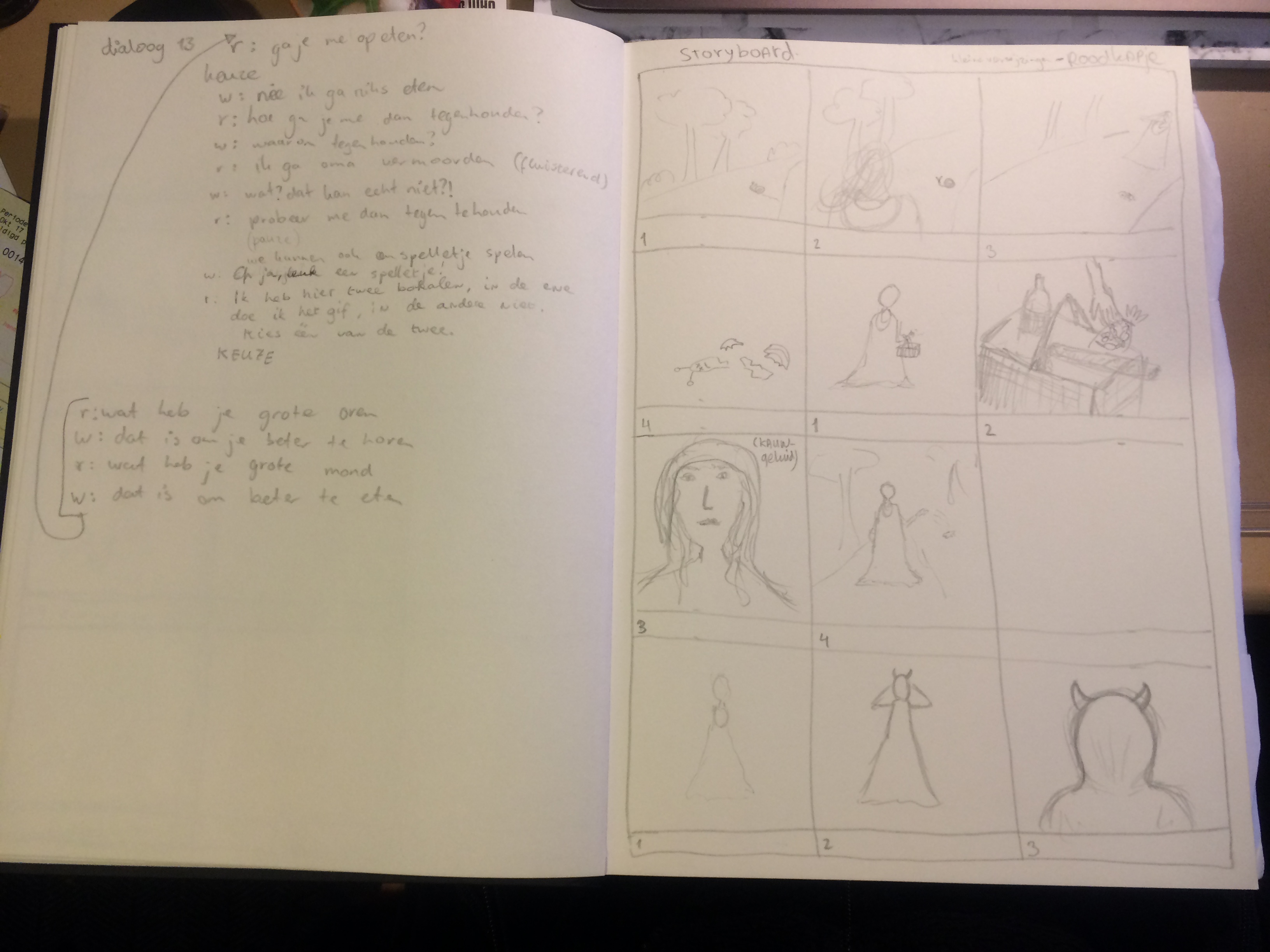
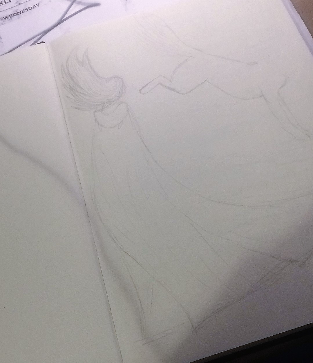
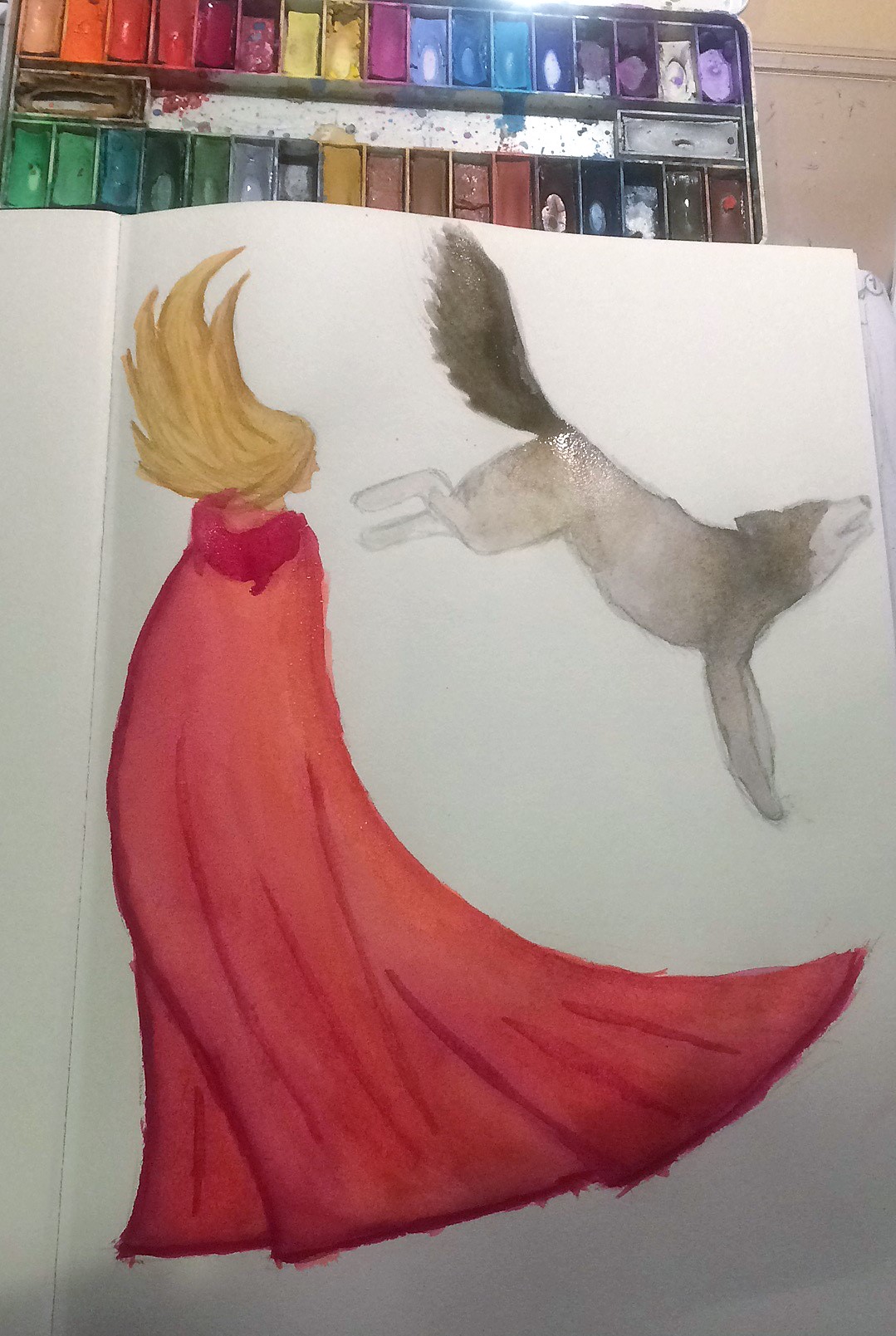
And here you see the titel page of this project. My plan is to work out visually as many parts of projects in my dummie, so every single project gets its own titelpage. Our story is about the red riding hood, so in that theme I made this.
written on: 11 September 2017
by: Charlotte van Doorn
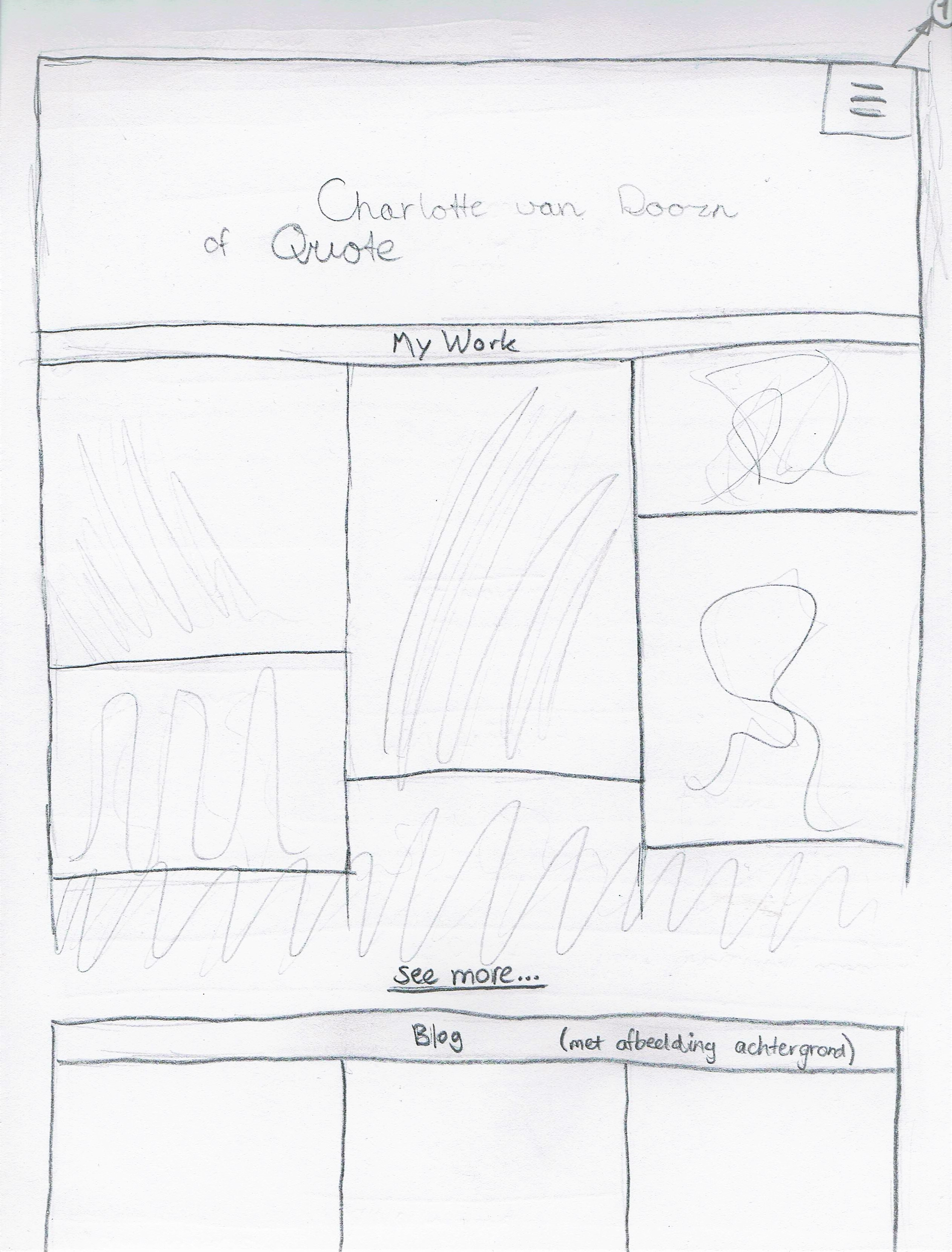
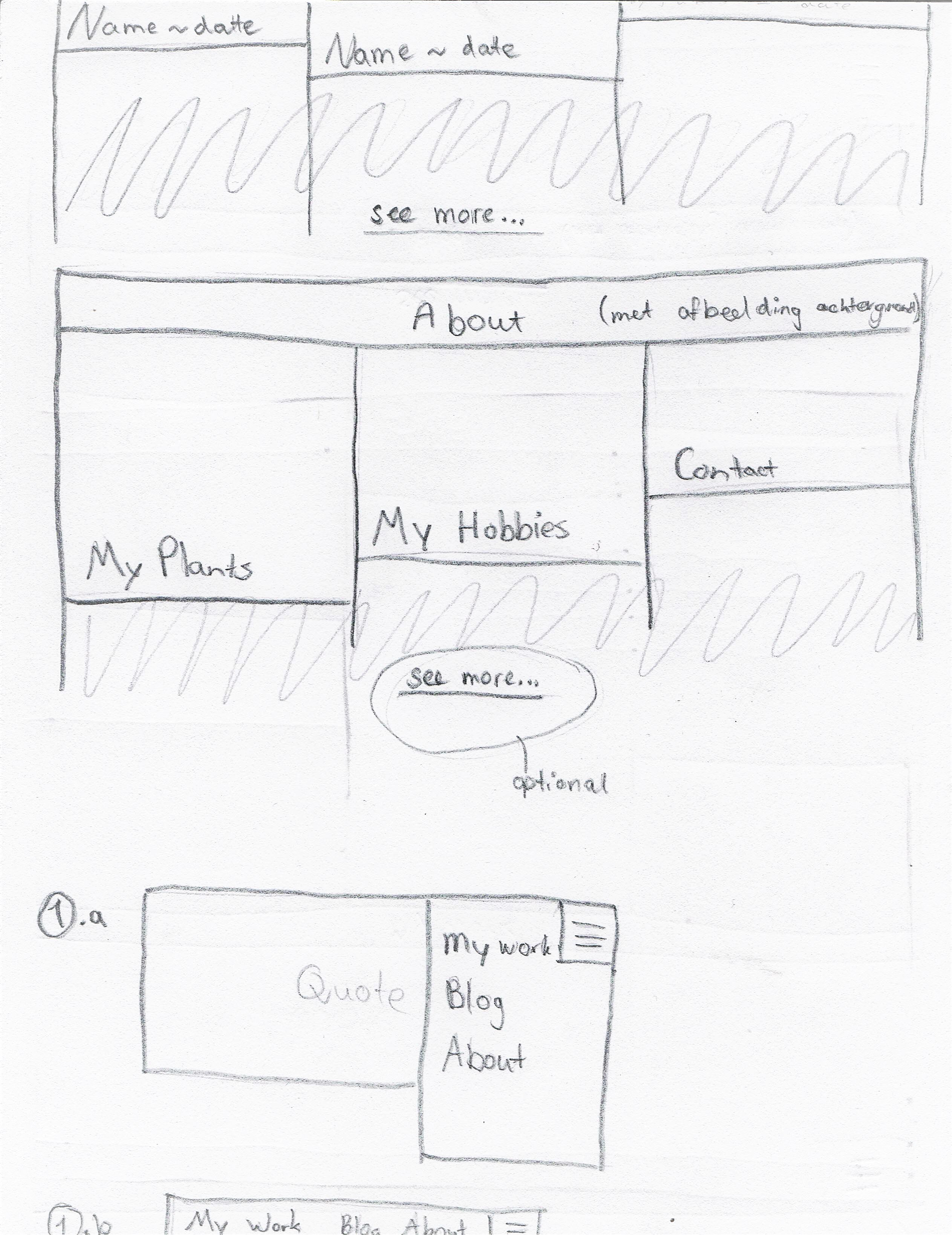
These are the sketches that I made to design my website. At first I copied a template, but I wasn't fully satisfied so I desided to make changes till I like it. However that will be fairly hard since I like many things and later dislike them.
written on: 10 september 2017
by: Charlotte van Doorn
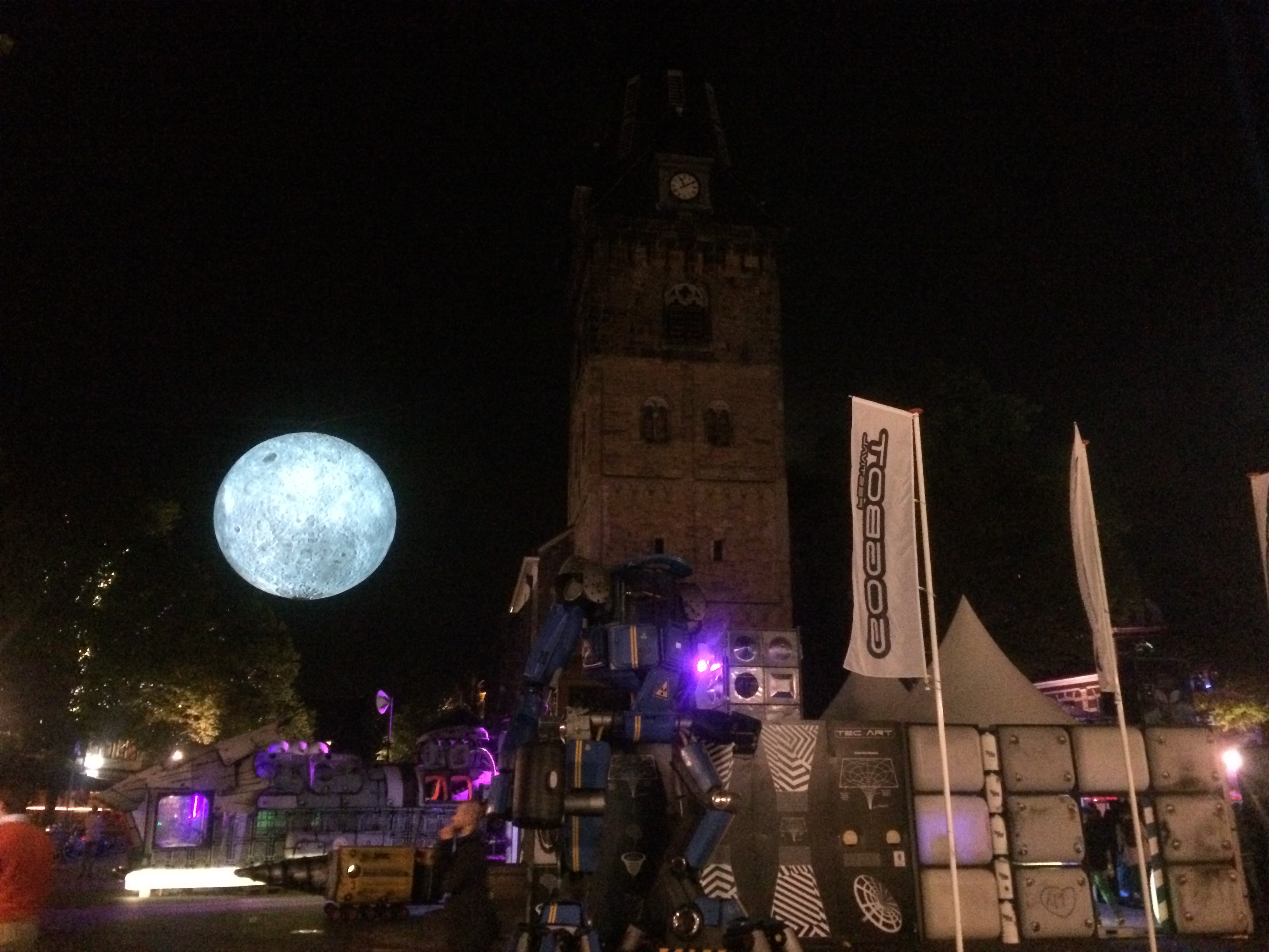
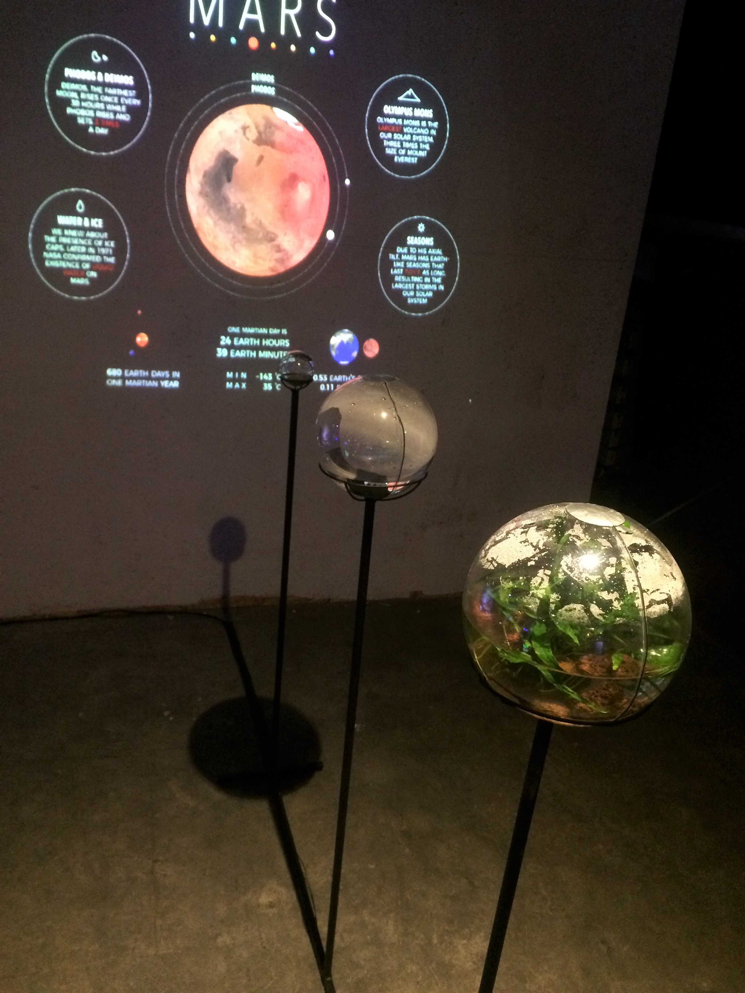
For fun but also for an assignment, I went to the festival with a couple of friends. We went on the first night.
Terrestrial Planetarium made by Celine Veltman from HKU Utrecht.
As partially visible on the picture, there was a screen with the sun on it. In front of the screen were four transparent balls which represented the four planets closest to our sun. The balls were on a scale and differed from size, just like the planets do. Every ball contained an element that is present on that planet, for example the Earth ball contained plants and the ball of Mars was filled with red sand. On the outside of the balls, there were metal wires attached and a metal circle, as you can see on the picture. When you laid your hand on top a ball, there was info shown on the screen about that particular planet. I liked it the most because it had an educational purpose. This could be used in school for children to learn about planets and to have an interactive education. An interactive education helps the children to understand and to remember it better in the future.
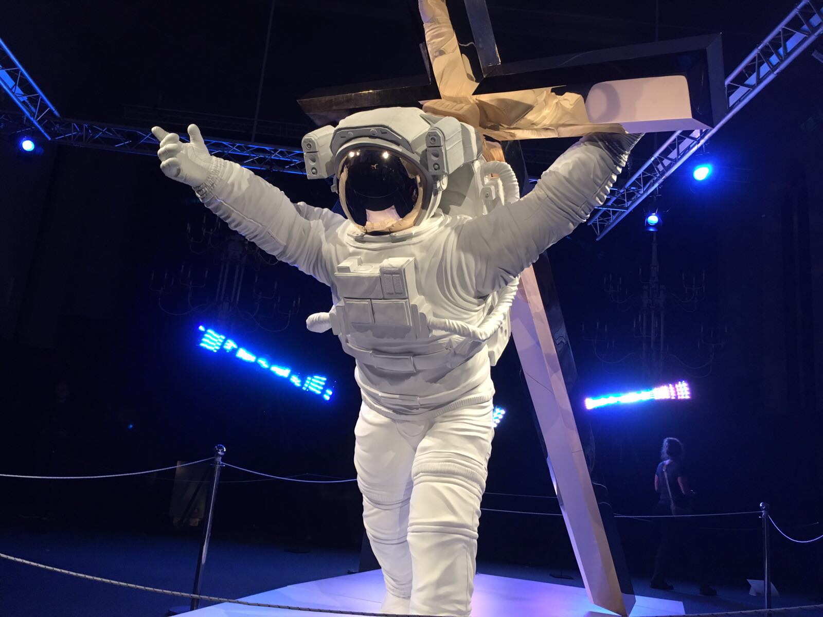
A thing and its essence by Joseph Klibansky.
It is a sculpture of an astronaut holding a cross just like Jesus had to do. I am not religious, so that is not the reason that I dislike it. It irritates me because in my opinion it is disrespectful. People dedicate their lives to a religion, and for artists to just use parts of that religion, and ridicule it by using an astronaut instead of Jesus. Another reason why this irritated me is because it had absolutely no purpose. In my vision, GogBot is about technology and interaction, two expectations this sculpture cannot meet. It also irritated me because this sculpture provoked emotions of disgust, which I did not want to feel.