Peer review comparisons - 15th of November
| Title of site | Over-all score | Date of last post | Number of portfolio items | Types of Social Media Connections | Performance on mobile |
|---|---|---|---|---|---|
| Sem de Muinck Keizer | 2.6 | 6th of November 2019 | 5 | Email, phone, Instagram | Bad |
| Daniel Diaz Olson | 2.8 | 5th of November 2019 | 3 | Reasonable | |
| Froukje Temme | 4.4 | November 6th 2019 | 9 | Facebook, YouTube, Instagram, Snapchat, address, phone, email | Excellent |
Which website did you think was best?
I'll definitely have to go with Froukje's website. Even though she's used templates for the basic layout, she's really personalized her website and she has some great features on it. As you can see in the table, her website is above the other two on basically all the aspects. The other 2 don't have a bad website, but there's just more and better functionality on Froukje's website.
Second and third peer review - 15th of November
Review 2 - Daniel Diaz Olson
Review
Overall, his site is pretty good. There were some nice elements that I recognize from my own site, so I liked to see that. The site did seem a little empty, but that could of course be a choice. Daniel's used an internal stylesheet (styling within the HTML), which has given his page a bit of a personal touch. I don't know whether it's actually better to have a separate CSS file, but I do like using that myself since it gives a bit more structure.
Reflection
I liked reviewing Daniel's site, since you can see that he's put effort into it. The fact that he's put in some of the elements that I'm using as well is nice to see, and also encourages me to keep improving that (since apparently people like to see it).
Technical details
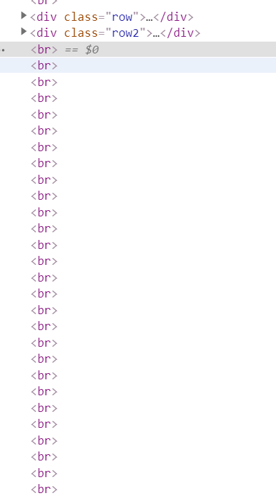
The code he's used is rather simple, but that also keeps the overview pretty good. There's one thing that caught my attention though, and that's the excessive use of the br command. An example of that is on the right.
Review 3 - Froukje Temme
Review
This site looks really good. Everything seems to be working smoothly, and the design as a whole looks very well executed. She's used two different bootstrap templates, but has added her own design and content to it. Even the mobile site works properly, but that could also be because of the default settings in the bootstrap templates. Overall, really good.
Reflection
I think I can learn a lot from this site. I personally don't use templates, but when I see sites like this I do think I could make my website even better. She's added some features that I might use myself as well.
Technical details
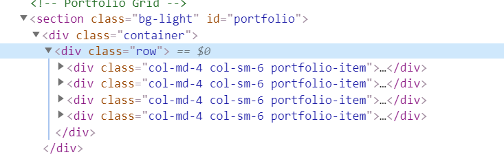
I personally really like the pop-up window for the portfolio pieces. I really think that I could use that on my own website to improve, so I really like that page of hers. To the left there's part of the code for her portfolio pieces.
Final Module Expo - 12th of November
On the 5th of November, we got to present our final results of both Visual Communications and the Interactive Video Project. We all got to invite some people, so I invited my dad to come see it. He was really excited about all the projects, and so was I. I've really enjoyed seeing the other videos as well, and see how well some groups have done that. It was also cool to see all of our posters hanging there for everyone to see. Eventually, our group didn't win (we got somewhere in the middle of the scoreboard), but I had tons of fun. The winning group did a really nice job, although I personally preferred the group that got second (group Papa). In the blog post below you can read something about our video project, and on my Portfolio page you can see the final result of our Visual Communications class.
Interactive Video Project - 12th of November
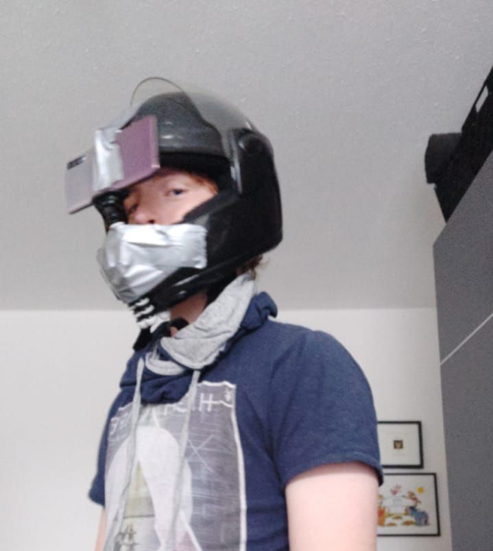
You can now view the result of our Interactive Video Project in my Portfolio! It was a lot of fun to make, especially with all the filming techniques. We've used a very specific one, since all of our shots are in a first person view. The picture on the right is me with the rig on, which is a helmet with a tripod taped to it. It's rather improvised, but it was so much fun to do. You can click here to go to portfolio page or click here to open a new window with the interactive video straight away.
Visual Communication Final Result - 3rd of November
I've finally finished my VisCom project for this module! You can see the final result here, but you can also visit the CreaTe expo on November 5th in the SmartXP. There you can also see (and participate on) our Interactive Video Project!
Peer Review - 16th of October
This week, we had the assignment to review one of our peer's website. I reviewed Sem de Muinck Keizer's website, which you can find here. It was a lot of fun to review a website, and I think I got to give some useful feedback. The site itself worked pretty well, but the design had some flaws. A good thing (to me) is that he hasn't used an external stylesheet, so he programmed the entire site himself. There was definitely some room for improvement, but he's come quite a far way already.
How did I realize my 'personal touch' for this website? - 1st of October
 Since I
did this study last year already, I knew a bit about programming websites already. I used a part
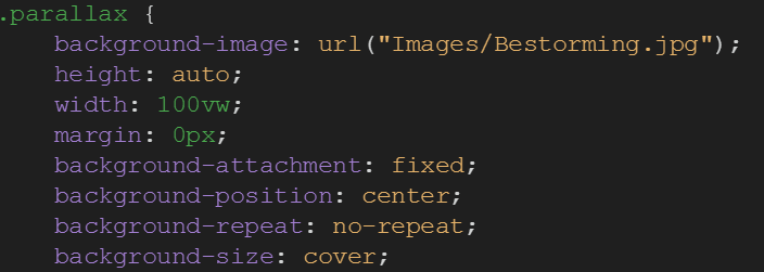
of my code from last year, which most importantly contained the parallax effect. The parallax
effect is the effect of content "rolling over" the background. I really like this effect, hence
why I used it again. There's still some details I need to work on, but I do think it looks
really good. To the right, there's (part of) the code I used to create this effect.
Since I
did this study last year already, I knew a bit about programming websites already. I used a part
of my code from last year, which most importantly contained the parallax effect. The parallax
effect is the effect of content "rolling over" the background. I really like this effect, hence
why I used it again. There's still some details I need to work on, but I do think it looks
really good. To the right, there's (part of) the code I used to create this effect.
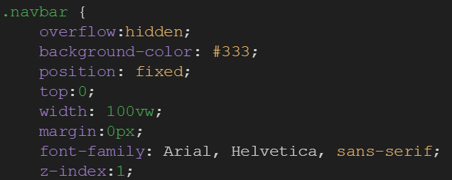 Another personal touch that I like about my website is
it's simplicity. It may sound a little stupid, but I want to keep my website as simple as
possible. I want the whole to look slick, and I think the navbar I'm currently using really
helps with that. The hover effects just give it that little 'something' that I'm looking to put
into my website. Overall, I just think it gives the website the look it needs. To the left,
there's the code I used for the navbar itself. There's also some code for the hover effect, but
that's only 2 lines.
Another personal touch that I like about my website is
it's simplicity. It may sound a little stupid, but I want to keep my website as simple as
possible. I want the whole to look slick, and I think the navbar I'm currently using really
helps with that. The hover effects just give it that little 'something' that I'm looking to put
into my website. Overall, I just think it gives the website the look it needs. To the left,
there's the code I used for the navbar itself. There's also some code for the hover effect, but
that's only 2 lines.
Second Portfolio post - 1st of October
There's another post on my portfolio page! In this post you can check out some videos me and my dad made, where we re-enact famous movies for pubquizzes. Click here to see it!
Progress regarding the Interactive Video Project - 25th of September
A few weeks ago, we got the assignment to make a video where you - the watcher - has to make choices that will influence the outcome of the video. Everyone got assigned to a group (within your own tutorial group), with whom you'll work with. We've had one Video Skills lecture where we got to brainstorm about another idea, but we also managed to talk about what we wanted to do for this project. We all agreed to make it a first person movie, and the theme will most likely be a detective at a crime scene. There you'll have to make choices on what to inspect, who to interview, and ultimately, choose who's guilty.
New portfolio post! - 25th of September
There's a new post on my portfolio! There you can read all about the assignment we got for one of our classes, and see the creations I made for it. To see the post, click here!
Progress on my website - 18th of September
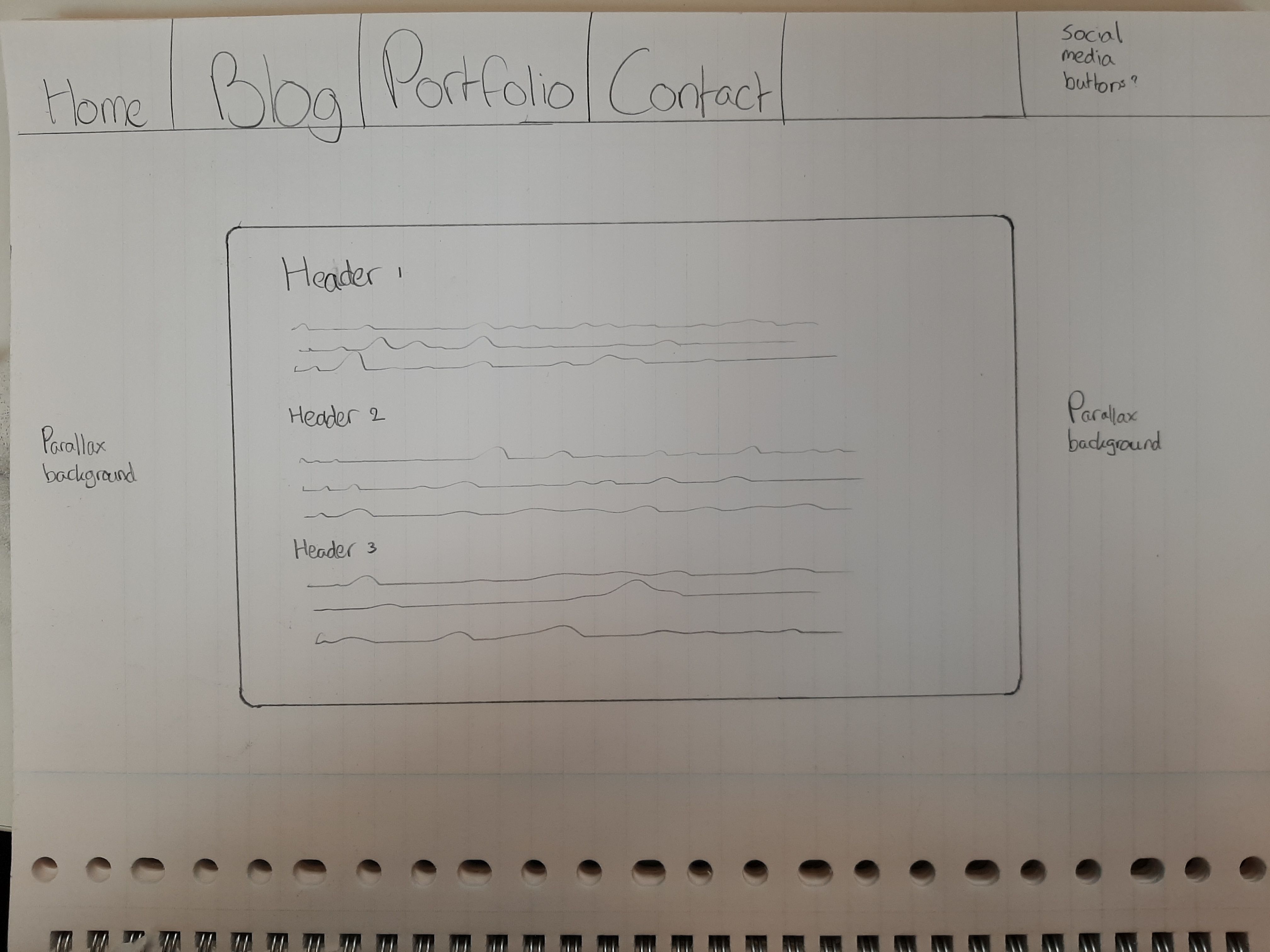 For the past 2 weeks, I've
started all over with my website. I've re-used some elements I used last year (such as the
parallax effect), but I did want to try some new things. I want to keep my website between
playful and professional, while keeping everything clean and simplistic. My background adds a
lot of color to the website as a whole, so I'd like to keep the rest minimalistic, also
regarding color use. I'm really happy with the current (menu)button hover animations. I'll
probably keep using the layout I'm currently using, since I think it looks pretty good as it is.
I would like to work on multi-device compatability, so that the page values (such as the page
height or the image size) aren't hardcoded. To the left there's a sketch of what I'd like my
website to look like (even though it already almost looks like that).
For the past 2 weeks, I've
started all over with my website. I've re-used some elements I used last year (such as the
parallax effect), but I did want to try some new things. I want to keep my website between
playful and professional, while keeping everything clean and simplistic. My background adds a
lot of color to the website as a whole, so I'd like to keep the rest minimalistic, also
regarding color use. I'm really happy with the current (menu)button hover animations. I'll
probably keep using the layout I'm currently using, since I think it looks pretty good as it is.
I would like to work on multi-device compatability, so that the page values (such as the page
height or the image size) aren't hardcoded. To the left there's a sketch of what I'd like my
website to look like (even though it already almost looks like that).
My Gogbot visit - 17th of September
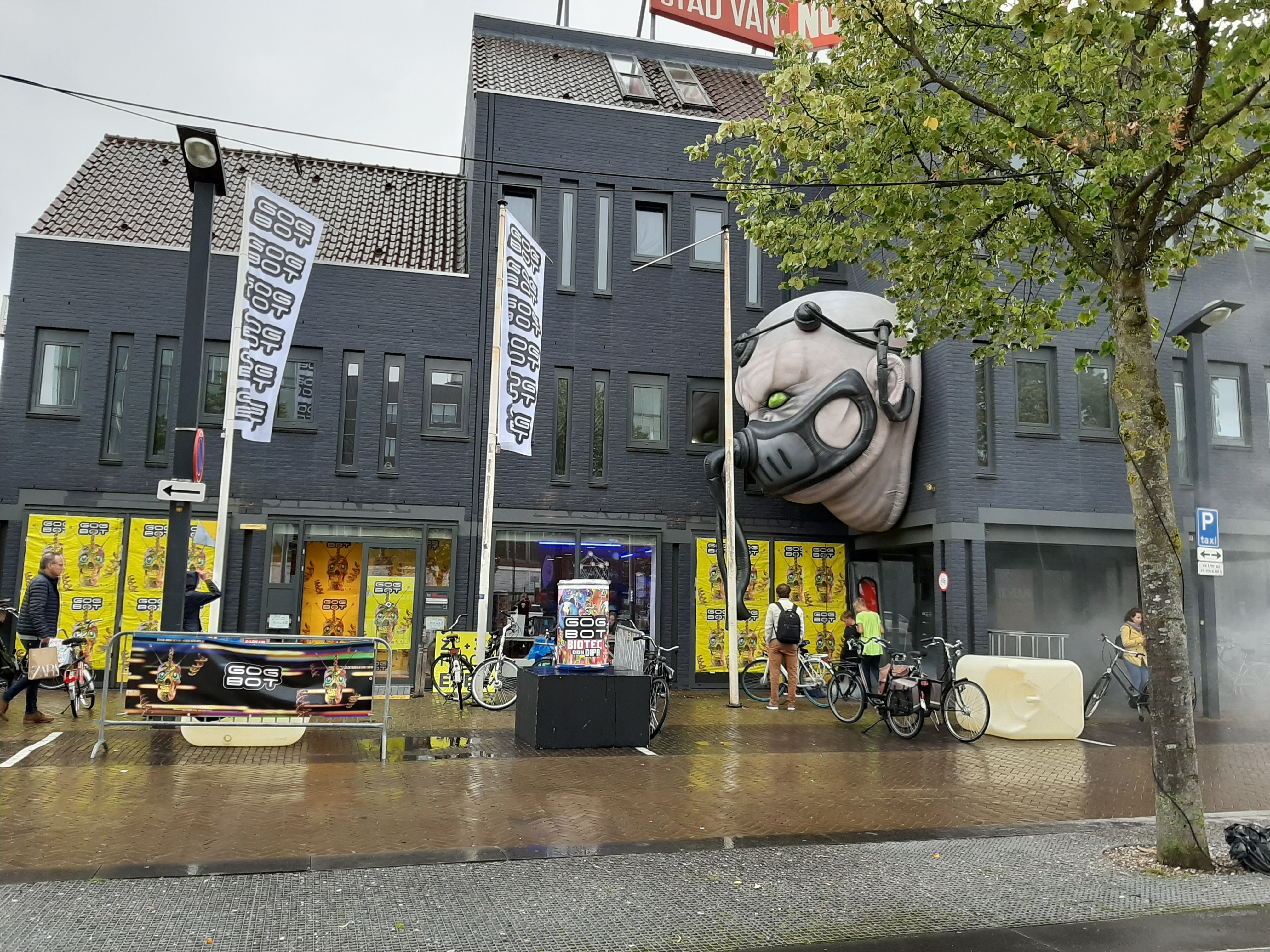
This year, I've visited the Gogbot festival twice. Once on the Friday, also to see some of my friends from last year who were presenting their installation there, and once on the Sunday, to take some pictures.
While I was there, I only visited the CreaTe part of the exhibit, and didn't go to the Oude Markt. It was very interesting nonetheless. I'll walk you through the 2 exhibits that stood out the most to me
Exhibit 1: Circulux by Reinout Scheepers
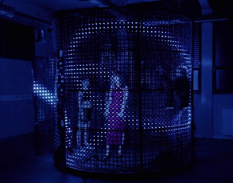
The concept of this exhibit is a cage that consists of a total of 6000 LEDs surrounding you. Around the cage, there's also speakers positioned. As a result, you completely immerge into the cage, since the LEDs are so bright that you can't really look beyond the lights. The fact that the room the exhibit was in was dark also really helped. Overall, the experience to be completely cut off from the rest of the exhibit was really nice. However, after leaving the cage, the purpose wasn't completely clear to me. It looked nice, and it was a really interesting experience, but I kind of missed the message that it had.
Exhibit 2: All Boundaries are Conventions by Rowan Sörelid
This exhibit consisted of 2 old fashioned TVs, placed on the ground. The exhibition was placed rather far in the back, so there weren't a lot of people watching when I was there. One of the TVs was playing the collapse of the 2nd Twin Tower in reverse on loop, while the other TV had a laptop placed in front of it. When you pressed the spacebar, the video would start playing on the second TV. The video was the plane flying into the 2nd Twin Tower, but it had the typical American baseball sound playing. Once the plane actually hit the tower, there was a loud applause. I was pretty shocked by the exhibition, because it seemed rather insensitive. But, after thinking about it, maybe that was exactly the intention of this exhibition.