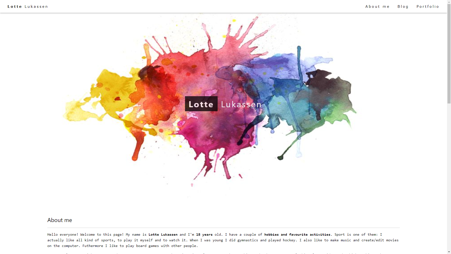
This week we had to peer review a site of a fellow student. I reviewed the site of Lotte Lukassen.

Review
My first impression of the site was pretty good. It looked nice and minimalistic, what I like. You don’t get overwhelmed by it. The readability of the site is great, because of the use of black text on a white background. One thing I found a bit of a weird choice was to put the emphasis on herself, instead of on her work. Of course this might be personal preference, but this is my opinion. I would also have added a contact form to be able to get in touch with the maker of the projects you just saw on the site.
The portfolio on her site isn’t that big yet, but of course there’s still some time to expand it. Maybe she could add some of her earlier work to, so the visitors can see those as well.
The last thing I wanted to talk about was the linking and navigation on the site. The linking is pretty good overall, but there are some links that could be a bit better. For example, when you click on a link to a blog post on the main page, you don’t directly get to the blog post itself, but to the main blog page. When you’re there, you have to go and search for the blog post again. It’s not that hard to solve this, but it would have a huge positive impact on usability.
Overall, it’s a pretty nice site. And with some tweaking, it could be a great site!
Reflection
When you’re reviewing you’re probably comparing it to your own site, but also to your standards. Of course you would like to let your own site meet your standards, but that’s not always possible on this level yet. Of course that’s also the case with site of other students. I really tried to give some constructive criticism and tips to improve the site. When I compared it to my own site, I also stumbled upon some elements that I might include or change on my own site. I also learned that it’s not that easy to make a good site, especially if you don’t use a tool like WordPress. You really have to think about a lot of things to make your site look good, but also to make using the site nice, easy and intuitive.
Analysation
The site I reviewed used a W3Schools style sheet, with some minor changes like fonts. The portfolio page itself doesn’t use a gallery, but just text. When you click on the title of the portfolio piece, you get linked to the page with a picture/video of the piece.
