I have to start by saying that I consider all 3 of these websites to be well made, a lot of effort clearly went into making them. That being said, lets start comparing them and see which one is best.
| website | Student 1 | Student 2 | Student 3 |
|---|---|---|---|
| Overall Score | 4,4 | 3,6 | 3,2 |
| Date of last Post | 11-08-2018 | 11-08-2018 | 11-08-2018 |
| Number of portfolio items | 2 | 2 | 5 |
| Types of connections | Behance, instagram | spotify, facebook | - |
| Mobile performance | excellent | do-able | excellent |
The best looking website has to be that of student 1, navigation is clear, all elements are clearly visible and mobile performance was great.
However, the website was made using wordpress, which means that all the fancy animations and nice layouts are slightly less impressive.

Student 2 also had a very nice unique website that very much follows it’s own style. When you first enter the site you are immediately greeted
by a nice image that tells you a lot about this person. Page navigation is ok, but the  buttons are not super responsive and the navigation menu
isn’t always accessible from all parts of the site.

Student 3 might have the lowest overall score of the 3, but this number is slightly skewered. There is no connections to social media on this site,
so I couldn’t really award points for that. But in my opinion connectivity is not what makes a site great. This does a lot of other things well.
When you start the site you are immediately greeted by a nice artistic image that defines a clear style for the rest of the website.
My main complaint about the computer version of the site is how chaotic the portfolio page appears to be. This however is a lot better on the mobile version.
On mobile this site performs way beyond my expectations, everything is very clear and easy to read, the layout feels a lot better. I get the feeling this site
might’ve been developed with mobile functionality in mind.

Overall thoughts:
Although student 1 has overall the best looking website I’m not sure if I want to consider it as that, since it was made using wordpress.
Don’t get me wrong, the website is still impressive and well made, but making your own website in html deserves more credit.
Therefor the best website of the 3 has to be that of student 3. The style is well defined and the site is very easy to navigate.
The first page is a bold image that I personally really like. But what really makes this site the best is the mobile experience. Good job student 3!
2 days ago we had the final expo for our video projects. It was a lot of fun to see what other people had made of course. and some people even presented their programming assignments or visual communication posters. In the end a lot more people came to look at our project than I initially had anticipated. although not everything went smoothly in our group, especially in the final days, i feel like overall we learned a lot working on this project. for me this was the first time working on anything related to filming, so there were a lot of new expriences. If we had to do it again I feel like we could have presented a far better video, but thats how things are, live and learn.
by now i feel like i have made this website my own. There is still a lot that can be improved but now its actually something i can show to people. i stuck to a mostly blue theme, which i think works great. It however doesn't really give a professional feel, but thats ok for now. the background image I used was something i took myself at an aquarium. the element im proudest of so far in my website is the navigation menu, it uses different classes and has an actual hover effect (.navigation a:hover) what also took some effort was to get the game i made in javascript actually playable on my website, i used an iframe for this that refers to another website. all styling elements are declared in the external stylesheet, h1 to h4 ass well as a body and the navigation elements. for example: the background image is declared in the body{} element of my style stylesheet. the main part i still want to improve is the look of the blog, for now it's okay but it can look a lot better as well. I feel like I dont know enough about graphical design to properly match colours and layouts, but at least i've made something that is my own. I'm also still looking for something extra to add to my homepage.
I've added my final project from programming to my portfolio, you can find it here.
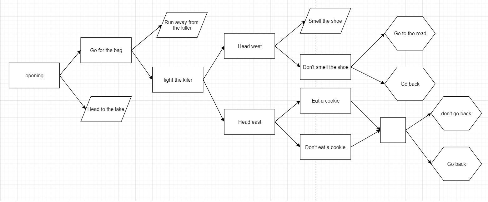
we are working hard on our video project, on the right is a flowchart of the options we want to give during the video. We've filmed all the scenes and we currently have to edit them and add them to Ximpel. (for one scene i had to swim in a lake, which was fun...). our story is about someone who wakes up in the woods with no memory of how they got there, or why they are tied up.
i've added my first piece of work to my portfolio page! you can find it here. it's a game I made during a javascript tutorial. try it out! Its not very interesting yet, or complicated, but its a start, this is the first time i've ever done anything with javascript
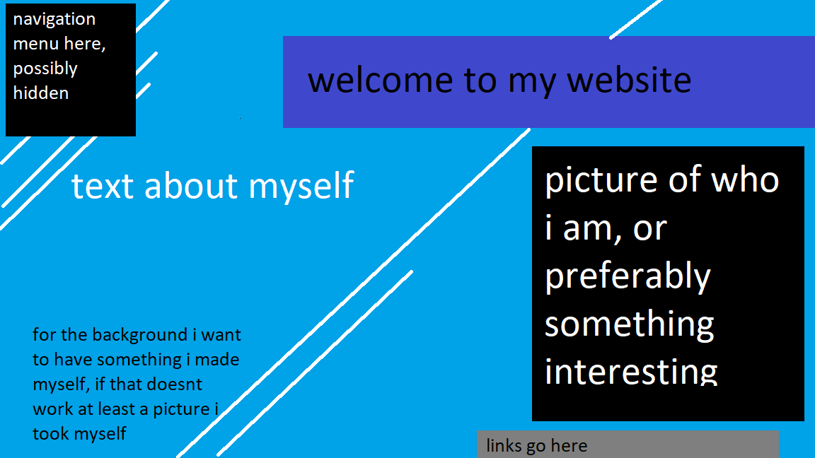
The website so far is ok at best, i'd really want my website to somehow look more professional, with an interesting and preferably responsive design. I've added separate pages for the blog and portfolio, i've also made a stylesheet shared for all 3, maybe each page should have its own stylesheet? I'm also trying out different colour combinations, to see what goes well together. I think i want the overall theme to be blue-ish, but im not sure yet, black and white looks more professional. In regards to my portfolio: I do not yet have anything to add there, I hope i'll be able to display something im proud of soon.
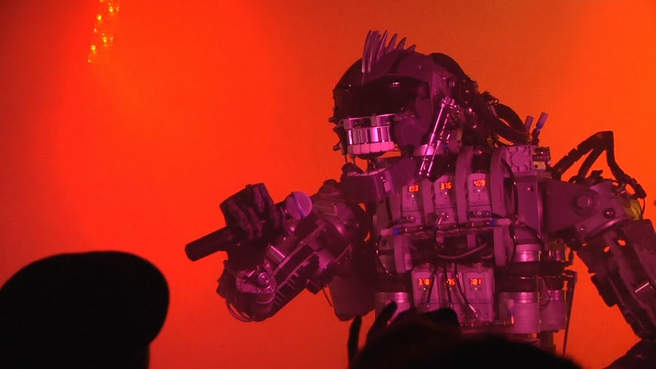
My favourite installation was the compressorhead band. A band made up of 6 members which were all robots. Overall it looked like a massive amount of effort went into the creation of these robots. Their movements were extremely realistic. It was a very unique experience to see a band completely made out of robots perform and actually sounding good. It might not have been as interactive as some of the installations but the human-like performance made up for it. And above all I had the best time at the festival listening to the band.
this installation focuses on a dialogue between a person and a robot. To raise questions about what makes us human. The main reason this installation irritated me was because there was no interaction between it and anyone attending the festival, displaying the conversation in text format would have had the same effect. Another reason was that I did not agree with the message it was trying to send. Most of the questions and answers had a very negative tone and outlook, which I happen to disagree with. The installation feels like its meant to induce fear in the viewer about the direction in which technology is headed, this however feels kind of misplaced in a festival celebrating technological achievements of students and creators.