The changes I've been talking about are finally happening. Not all of them, unfortunately, but I've updated the portfoliopage and I must say I really like the concept
of it. I think it looks clean and organised. You can now click on the different images to go to a new page for more info on the projects.
The layout looks great to me, but I want to work more on the visuals. The visuals is what I'm updating next. I dont know what or how, but I want to make it look even
better, so better desciptions for the projects and making the website more vivid.
Next big update, 10-01-2021
So lately I've been updating my portfolio and noticed that everything looks kind of boring and the same. That's why I'm planning on updating
the look of my website. I want to update the portfoliopage first because that one feels like it needs some more attention. I'm planning on
making three columns with all my projects in there.
From there, I might want to add a seperate page for each project. However, I might also do that for just some of the "bigger" projects.
Maybe I'll make two columns where one is a bit bigger and has more desciption. Or maybe make the big ones clickable to get to a new page.
I'm not entirely sure yet, but I plan to update my portfolio somewhere this spring.
After that, I want to work on the visuals of the website, so make it feel a little less boring by adding more shades, better headers, backgrounds,
more interactivity when hovering over things, stuff like that.
When I get all of that out of the way, I want to update my indexpage because right now it seems kind of boring and empty. I'm not entirely
sure what I want to change or update or how I want it to look because I haven't really put much thought in it. But I feel like this will be
part of an even later update as I dont want to put all my effort there. But don't worry, I will try to get the portfolio update live as
soon as posible.
Module Closing, 06-11-2020
Yesterday we had the closing of our module with our study coordinator. Normally, during the module closing
students get the see the posters other students made for Visual Communication. It is a very fun way to review
posters and get yours reviewed. But this year, we had it online because of Corona. So we were all in a meeting
with our study coordinator and talked a bit about the past and coming module and answered the remaining quistions
we had about grades and things like that. Meanwhile, a video displaying all our posters was playing, so we
could still see some of the posters we made. I think it was quite fun and saw a lot of really cool posters.
There were also a few questions about the video project and how we had to finish that. The coordinator said
that we should review other videos and ask for some feedback by others.
We were told that the editing was really well done and that the camerawork was great with interesting shots
and angles. Also, the added screen recording is a really cool feature that worked out great. However, a thing
to improve would be to pay more attention to the audio.
I reviewed a video myself too. I reviewed this
video. I really liked the story of the video and I thought the options "think harder" were really fun. In my
opinion, the acting was quite good and the looked really natural to me. I think an improvement can be made by
making the choices appear at the end of the scene though. But overall, I loved the video.
Peer review, 14-10-2020
Today I reviewed another student from my study. I learned a lot from it and I will talk about it here shortly.
For privacy reasons, I will not tell the name of the student I reviewed. I thought the site looked really good
and made seemed like a very happy website with all the different colours. I did have a few points for improvement,
for example adding something in the navigation bar so that that shows me where I am too, or indicate more clearly
where a blogpost starts and stops. I also thought the menu popping into the screen was a cool animation, but
since there was nothing else on the website popping in, to me it looked kind of weird.
If you want to see the website for yourself, you can click on this link.
I now want to talk a little bit more about the youtube video that was posted. The code for this is as follows:
The code first defines the width, height, link and border of the video. the accelerometer and gyroscope are allowed so that when a mobile screen is tilted,
the video will tilt as well. The autoplay is so the video can suggest a next video for you, which is also why encryped-media is allowed.
the clipboard-write is used so you are allowed to copy the link. The picture-in-picture is so that another site is allowed to open a floating window in front of the site.
And lasty, it is also allowed to fullscreen the video. In my opinion, I think it is a lot of code for a video, but this makes it fun to me because it is shown as such
a simple video, while there is a ton of info that cannot be seen except if you look into the code.
What i learned from this is not really new for me, but is reaffirms what I already knew. Coding is not that hard, but making coding look easy is hard. Even a simple thing,
like adding a youtube video, is not just a piece of cake that you can add without breaking a sweat. I think that this is a very important, but also fun part of coding.
Because if you do it well, nobody will find flaws and it looks amazing, but if you do it the easy way, then it will show so.
Programming assignment graded, 30-09-2020
So today I got my programming assignment graded. I was kind of nervous because I really wanted a good grade.
I worked hard for it, eventhough I already knew the basics of programming in Processing. This is because
I already had some experience with the language, since I made a car with an Arduino in high-school.
If you want to read more about it, I have a link here.
Improving my CSS, 29-09-2020
Today I worked all day on improving the css for my website. I didn't have a lot to
so today seemed like a good choice. I wanted to start off by putting every post on my blog in a
nice little box, so it would be better visible what the different posts were.
I did this with the following style.
So as you can see, I made a style for a section. I wanted it to be 1000 pixels width, and in the middle,
so thats what the first two lines are for. After that I wanted a little more space so I added a padding of 20 pixels.
The most visible part is the background color and the edges, which are defined after.
I also updated my front page a bit by putting my image on the right side of the screen like how I wanted in my first design.
After this I wanted to upgrade my menu, so it would look much cleaner. I tweaked it so that the current site would
be better visible and I made it stick to the top of the screen.
This is the style for the navigation bar on the top of the screen. It has a background color and hides things it overflows.
I fixed it at the top of the screen and made it take up the full width of the screen, because I thought it looked neat.
Lastly, I thought the css-file looked a bit messy so I put everything under each other instead of next to each other.
Usually all the different styles are put next to each other, but for me it looked rather messy, so as you can see in both
pictures, I put all the different things under each other.
I feel like I have improved my site lots, given how it was. I spend almost all day on it and I will call it a day. I'm going
to continue tomorrow and see how far I'll get. There are still a bunch of things i want to change, but for now, I'm satisfied.
Update on the video project, 23-09-2020
For a class we need to make an interactive video and I wanted to
share how that was going. So the assignment is to make a movie
that allows the viewers to make choices. I think the concept of
such a movie is really cool and I'm happy with the story we have so
far, but I won't be spoiling too much yet :)
So we wanted to make a story that felt like it was real. This is
why we chose to create a story with everyday protagonists. In border
to make the viewer feel in control, we want to let them decide whether
the protagonists will stay the same or try to deviate from their
behaviour. We are still unsure how we will exactly do so, but
probably with some sidecharacters that encourage them to. In this
way the viewer can decide whether to listen to them or not.
I'll include the flowchart to give a basic idea of what we are going
to do.
So as you can see, we start really early with a quite important
choice. There are just 3 possiblities of all the choices that
allow the end to be the same.
But I think I've spoiled enough for now, you can see the rest for yourself.
My vist at GOGBOT 20-09-2020
A few weeks ago I went to a festival called GOGBOT and I want to write
something about that here. I wasn't really in the mood to visit, but
once i got there, it was pretty fun. There were lots of installations and
I'll tell you about some of them. The one I remember most was a cube made
out of LED's and a few camera's next to them. The LED's would then make
a 3D-representation of you. I thought it was pretty awesome.
The next thing I want to share is an installation that would allow you
to play a game and beforehand you had to agree to the terms and
conditions. When you were finished with the game, it would show your
name and photo in a newspaper all over the screen. I think the
creator wanted to show us that we sould be carefull with things as
such.
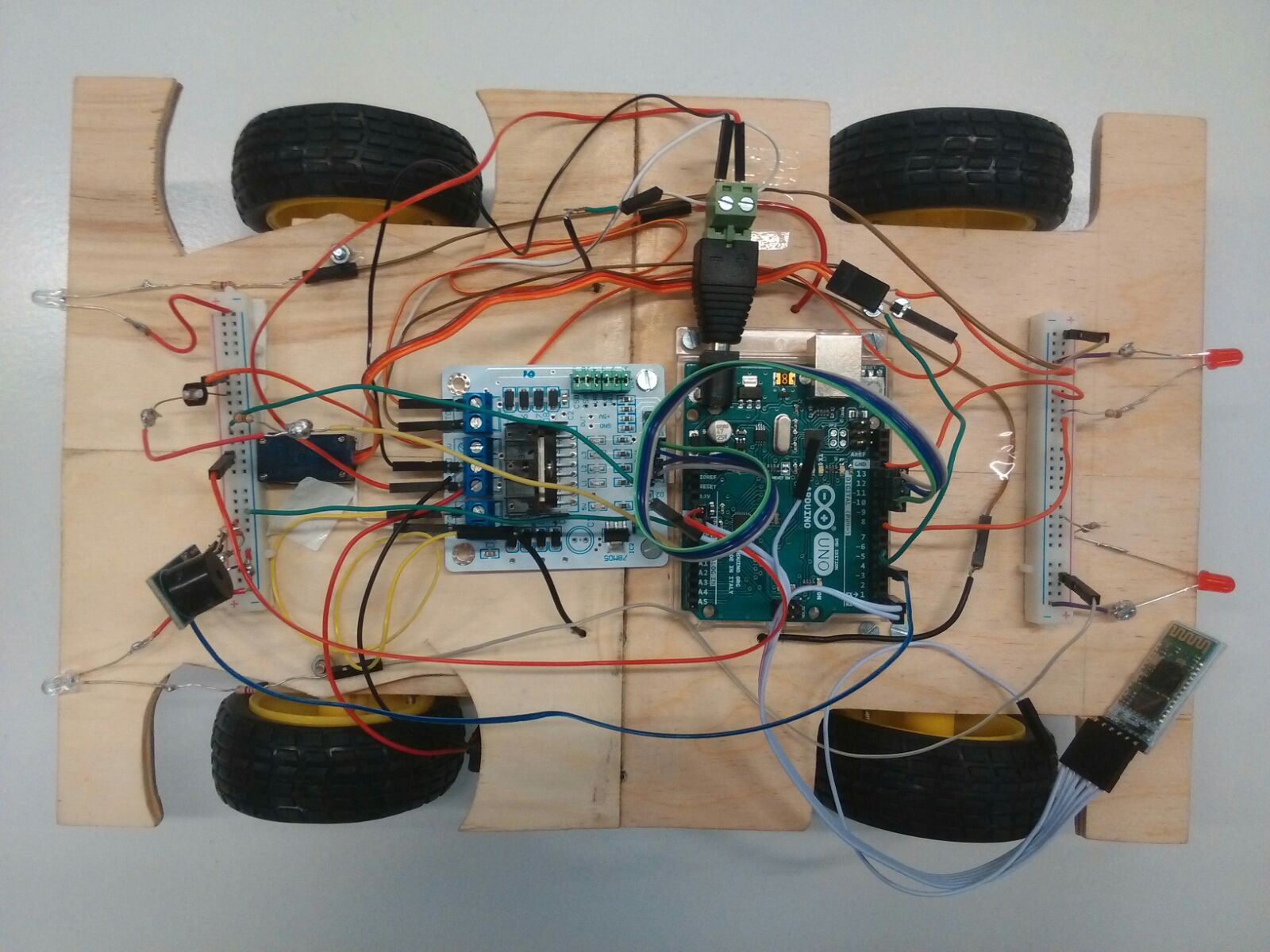
High-school project 16-09-2020
So this is a project I made in high-school.It is a car that we completely made ourselves. It is driven by an Arduino that you can communicate with using an app.
It is all built from scratch, except for the electric parts. I’m really proud of itbecause I never thought we’d be able to do it with the knowledge we had.
Even though it is not something I made during my studies, I still consider adding it to my projects because it shows what I’m capable of even when I’m not very used to the means that I use.
Also, I decided that I wanted to have the menu on
top of the screen instead of at the side.
Thinking about my design 15-09-2020
So today I was thinking of a design for my website.
I was thinking of a design that looks like this sketch I made.
So the website is basically divided by a menu on the left.
From there you can click the page you want to see.
I think I should start the site by a little info about me.
From the menu you can go to other pages
and find for example my blog and my other projects.
 The code first defines the width, height, link and border of the video. the accelerometer and gyroscope are allowed so that when a mobile screen is tilted,
the video will tilt as well. The autoplay is so the video can suggest a next video for you, which is also why encryped-media is allowed.
the clipboard-write is used so you are allowed to copy the link. The picture-in-picture is so that another site is allowed to open a floating window in front of the site.
And lasty, it is also allowed to fullscreen the video. In my opinion, I think it is a lot of code for a video, but this makes it fun to me because it is shown as such
a simple video, while there is a ton of info that cannot be seen except if you look into the code.
The code first defines the width, height, link and border of the video. the accelerometer and gyroscope are allowed so that when a mobile screen is tilted,
the video will tilt as well. The autoplay is so the video can suggest a next video for you, which is also why encryped-media is allowed.
the clipboard-write is used so you are allowed to copy the link. The picture-in-picture is so that another site is allowed to open a floating window in front of the site.
And lasty, it is also allowed to fullscreen the video. In my opinion, I think it is a lot of code for a video, but this makes it fun to me because it is shown as such
a simple video, while there is a ton of info that cannot be seen except if you look into the code.