- MODULE 1 EXPO -
07-11-2019
The first module has almost finished with the "Final Module Expo"
All students presented their works from classes the Visual Communication or Programming, but most importantly, everyone had to show their group's Video Project.
As there weren't enough screens available, our group had to show our video titled "Mornings" on a laptop.
This, and also our positioning in the SmartXP resulted in not that many people actually watching the video, but I felt like there were some way better videos presented anyways.
During the Expo I looked at some of the videos, especially the ones on the larger screens, and I especially appreciated when groups were able to use high-quality cameras or even drones, as it showed their attention for detail, and made the video more interesting to me.
Whenever I have to make another video for CreaTe in the future, I will from now on also try to use an actual camera, instead of using just a phone to record as it just makes the viewing more enjoyable.
The other part of the Expo I really liked was when people showcased their "Postcard" project, as many of them where in from of small games, which were quite fun to try out.
My favourite game was one with a ninja jumping around on clouds to avoid falling down, as there was a lot of work put into it and it had quite some replayability.
Overall, I am already looking forward to the next "Module Expo" as I want to see how other students improve on their skillset and learn over the course of the module.
If you want to take a look at our groups video "Mornings", please feel free to do so by visiting my portfolio section, or clicking this link:
Video Project "Mornings"
- WEBSITE REVIEW -
15-10-2019
I reviewed Mats van Braam's website.
Its a clean and professional looking site, with the concept of all content being on the same page, which makes navigation really easy.
I like his design choices of light colors a lot, and especially his photography section and the contact option on the bottom of the page surprised me in their quality.
All my suggested improvements for him were pretty minor and were just there to polish up the final bits of the website.
By reviewing another website, I learned about some features that would be nice to include myself, such as a direct e-mail contact option directly on the website.
As for Mats website, everything is on one page, it will take a long time to go over all technical details, so I will focus on talking about some examples:
Mats didn't use any tools such as WordPress to make his website, but he decided on using some css templates, the main one being from w3schools.
He also used some font templates, and made his own css file.
The website has some JavaScript included, mostly used for an modal image gallery, but also for the read more / read less buttons under his blog posts.
Feel free to visit Mats website:
Mats van Braam's Website
- WEBSITE PROGRESS -
02-10-2019
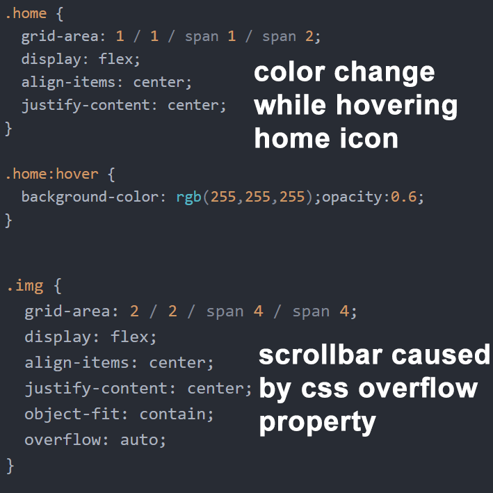
To fulfill my layout on my Website, I created some CSS to make a grid.
The Grid conveniently lets me arrange all objects on the website so they fit into my fundamental layout idea.
All the different containers that are part of the grid can have specific style options to format their contents.
You can probably already notice the scrollbar on the side of this texts container, which is result of me changing the overflow setting in my CSS file (Please scroll down to the bottom of this text to see the code better) for some containers.
The other CSS example is that if you e.g. hover the "HOME" icon in the upper left corner, its background will turn sligthly grey. (Again, please scroll down to the bottom of this text to see the code).
There is of course much more CSS code, but I tried to choose some of the simpler examples for this blogpost, to not make it too long.
If the 2 presented examples are not enough, I would also be happy to explain my self-made grid, but it extends the desired length of this post (especially the code screenshots).
Other design changes I've made in the portfolio section is to include an menu to choose between the portfolio posts, and to create some new icon style for my portfolio work.
I will try to create a similar overview for my blog section, but have to think of a fitting grid layout.
This website also still struggles with mobile users, as most elements don't scale with the width of the device yet.
- SHOWCASE PORTFOLIO -
01-10-2019
The second piece of portfolio work is now also online!
Feel free to have a look at it:
Multipurpose Parasol
- VIDEO PROJECT PROGESS -
25-09-2019
Our group still has to work a whole lot on the Video Project for "We Create Identity".
So far, we have a first basic story idea, which is about 2 people getting ready at home to meet each other later on.
We also have some scenes and choices of interaction planned out already, e.g. choosing to stop at a red light or not.
Another Idea of ours is to include a "Quick Time Event" in the video, where you have to make your choice in a certain time.
Our team will meet tomorrow to discuss an exact script and already scout out shooting spots.
- SHOWCASE PORTFOLIO -
24-09-2019
Finally, the first piece of portfolio work is uploaded on my website!
Feel free to have a look at it:
LED Keychain Pendant
- WEBSITE LAYOUT -
18-09-2019
The Website should basically have the same layout on each page, being based on the content always being in the middle of the page.
Other than that, I want my website to be really easy to navigate through and to have a visually geometric and minimal design, withouth flashy graphics or weird scroll options as the content in the end should speak for itself.
I also want to design my own font for the website fitting my theme of the reappearing black triangle.
At this point, there are still many desired layout features missing, so try to not be too confused by the navigation.
- GOGBOT VISIT -
17-09-2019
During my GOGBOT visit I first went to the Oude Markt into the Grote Kerk, to view the expositions there.
I was really irritated but at the same time intrigued by most of the exposits, especially the "Transfigurations" Project and the "Pink Chicken Project", as they had some of the strongest visual message in my opinion.
Later on, I went to the Stationsplein to view some of the CreaTe students projects, which were great aswell, as you were able to interact and play around with most installations, which made the visit more vivid and rememberable.
YOU HAVE REACHED THE END OF THE BLOG POSTS