I changed some aspects of my website to add more about myself for my professional carreer after the study.
The first most obvious thing I changed is the color pallet. I changed to the color pallet of the Achterhoekse vlag. I have lived there all my life, so I thought this would add a nice bit of personality to my website. I also added the flag on the right top to make it more clear
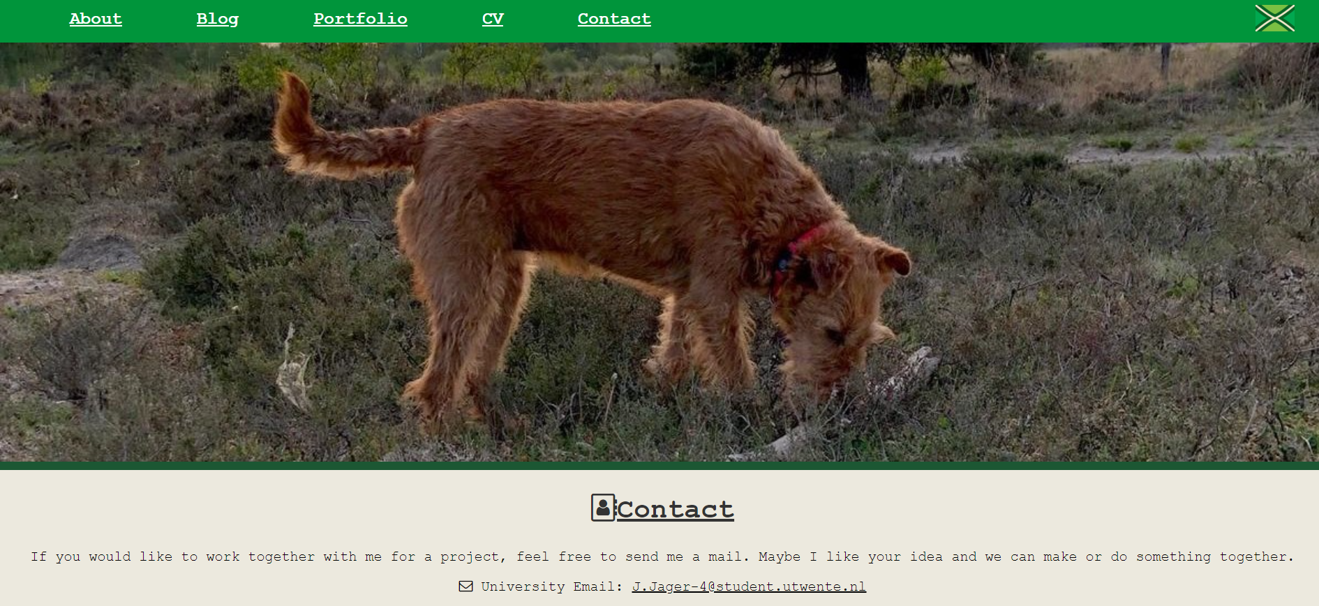
The second change I made was adding a CV page. By adding this page I can use my website as an extensive CV when I have a job interview.
The third change I made was a contact page. By adding this page people can contact me easier. I added several contact options to give people a choice of how to contact me.
The last thing I did was buying a domain name. With this my website is easier to find and my website will have a place after the study. The domain name I choose was jorisjager.com. By using my name for the domain name it is easier to find.
posted on 12-6-2020
New design
The website has got a new design. I decided to make a new design since the old design was not sufficient enough and the portfolio part of the website was unclear. Have a look on the website to see the new design.
posted on 16-6-2019
Final expo module 1
On tuesday the 6th of november we had the final expo of the first module. During the expo we as create students showed off our work what we made during the module. We showed our posters that we made for visual communication, some people showed their final project for programming and all the groups showed their final result of the video project. The end video that I enjoyed the most was from a group that made a video about Trump, Kim Jung Un and Poetin. Kim Jung Un was calling Trump. If you chose to pick up the phone, Trump and Kim Jung Un were going on a date and if you chose to ignore the phone Trump was going to play a shooting game with Poetin. They acted in a very hilarious way. That was what I liked the most about the video.
If you want to know something about my videoproject go to my portfolio.
posted on 08-11-2018
Peer review
I had to make a review of a website of one of my fellow students. I had to make a review from the website of Aine.
The homepage of the website was very nice. Her name was on the screen and if you put your mouse on a letter you can go to another page. Unfortunately, you can not go to an about or a contact page. When you clicked on that, you got a error. The website had a lot of small errors. An example of that, was that the text of the blogpost got under the Blog header on top of the page when you scrolled. There were no titles by the blogposts. That made the blogpage very unclear. The navigation was poor as well. You was able to go to another page from the homepage, but you can not go back to the homepage from the blog or portfolio page. You open a new tab when you click a link or a picture. That is not very handy. There are no links in the blog to the portfolio page.
The design of the website was okay. The color of the background is not the most handy. The background had was dark blue with yellow as you can see on the picture. The dark blue matches to much with the black letters I think. I should make a bright background so you can use black letters.
I want to analyse the portfolio page a bit more. The page consist of a background, a header and four pictures with a little text underneath. The background is made with a picture. Its position is top. She uses no-repeat so the picture does not repeat, the size was cover so it covers the whole page and the attachment is fixed so you can scroll over the background. She made the header on top with position fixed so it would stick to the position if you scroll. She made the classes gallery, desc and responsive for her divs. She made a border around her divs and made the line change color when you are hovering over it. This she did with the function hover. The box she made with the class responsive. She gave it a margin of 6px so it is not directly on top of the page. The class has a padding of 6 px so the divs will not stick to each other. With the class gallery she defined the style of the photos. She made the width 100% so it covers the whole width of the div and she made the height auto so the photo has the right height. She made a class desc for the description of the photos. She made the letters align in the center and made a padding of 15px so the letters are not stick to the border. She put the divs after each other so they will stand next to each other on the page.
The final conclusion of the review is that Aine has a lot of work to do to improve her website. I learned that it is very important to have a good navigation on your website. If you do not have that, it is very difficult to see what is on the page.
posted on 17-10-2018
My personal design
The first thing I did for my design, was making a header. I gave it a width, height and a padding and I gave it a background color. Then I put the text in the middle and gave it a white color. Every you put into the header is white now. Every header has a title in it and has my name on the bottom. The header has a larger textsize. I made the position fixed. Now if you scroll the header stays on your screen.
Then I added a navigation bar. I also gave it a width, height and padding. I also gave it a top margin so it would be underneath the header. Then I gave it its own background color. In the navigationbar will be the links to the pages off my website.
Then I added an article section. I also gave it a width, height and padding. I gave it a top margin and a left margin. Now the article section is underneath the header and beside the navigationbar. I made the background color white.
In the article section I will put all my articles.
Then I made link styles. I put boxes around the list links. Then I added a small padding to put the text a little bit from the border. Then I added link function for the list links. I added the function active and hover. Now the color changes if you hover over a link. The link of the page you are on is a different color as well. Then I made a normal link style. I made the text black and made it underline the text.
posted on 03-10-2018
Video progress 1.0: The idea
We have made a rough idea for our interactive video. We are planning to make a horror video with some kind of monster. The main character will have to choose things that can change his or her chance to stay alive. We are planning to film the video in an old abandoned factory in Hengelo.
posted on 26-9-2018
Progress week 39
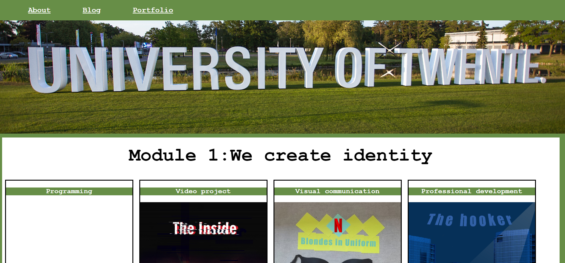
This week I have worked on my portfolio page. I have added the module with the courses on the main page. You can see that on the portfolio page. I have made seperate pages for each course. I have already added something to the courses visual communication and we create identity introduction lectures.
I have put my name in the header so you can see that the pages belong to my website.
posted on 26-9-2018
Plans 1.0: First design
I have made a lot of progress regarding design activities. I have made the design of my website. This is a raw design. The design you can see on the picture. I hope to get new ideas for my design, but first I have to learn more to make a design with more options. On blog I want to order my blogposts by date. I want to order the portfolio by module, course and date, but I have to discover how I can do that.
posted on 19-9-2018
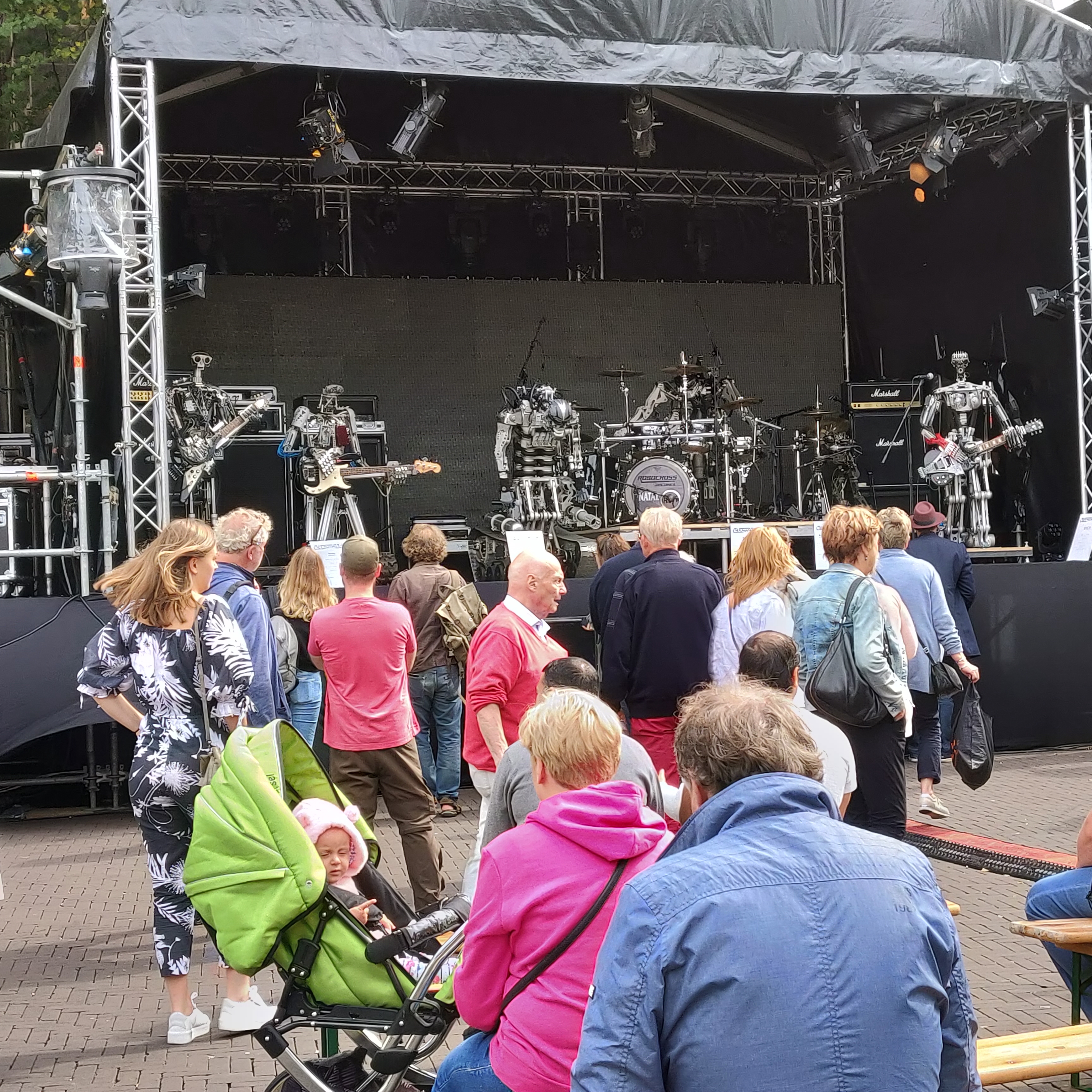
Gogbot 2018
Gogbot was very interesting. The installation that I liked the most was the robot band Compressorhead. The music that they played, sounded nice. They looked very complex and I want to know how they are built. They did not look like real people, but you directly knew what kind of robots they were and which type of music they played, because of the instruments and the head of the singer robot. They also danced on the music. That was proper programmed as well. I also liked the cable-management. The cables were nearly visible so they looked more like a real rock band.
One installation irritated me a bit. The installation that irritated me was the butterfly installation made by Jorrit van de Waal. They were irritating, because they made an annoying sound. They are useless as well. The function of the robot band was to entertain people. I have no idea who can find a use for this installation. The only thing it does, was wave with a newspaper. That is not usable for anything. It did not look like a butterfly. I had to see the sign first before I saw it was a butterfly. First I thought it was a mechanism to page through a newspaper, but it was a butterfly.