|
|
4-11-2016
We Create Identity End Exhibition
On Thursday the third of October the module of We Create Identity was closed with an end exhibition. In this exhibition we showed the project which we were working on this module. The project consisted of an interactive video. The one that was viewing could with his/her choices change the story line.
The schedule was that we set the tables, screens and laptops in 2 hours time up and have the exhibition 2 to 5 o’clock. However we were done with setting up our interactive video within 15 minutes, which resulted in a long wait of 2 hours before it actually began. After the 2 hours of waiting everyone could walk around and try out video’s from other students. You could see a lot of work went in these video’s and that people came up with good ideas.
A little problem with our video was that we connected it with speakers and since we have a scene were an alarm goes off everyone was slightly irritated because the night before was for a lot of people a really short one.
Besides the video’s there were also some nice snacks and drinks and all in all with was an interesting day despite the long waiting.
Click here to go to the video
|
|
|
17-10-2016
Peer-review
I reviewed the site of Sarah Petermann
The site is a very calm site with a lot of basic colors and very easy to read through. At first sight you're immediately welcomed by a drawing, setup symmetrical.
The menu is straight to the point with 'Blog' and 'Portfolio', but also confusing with 'Rudimental individual item-1863908'.
The type of font is light, this creates a lot of blank space, which results in a some what empty page.The portfolio page and blog page had a clear list of all the seperate posts and useable switches on the bottom of each post to easily switch between pages.
However you switched from blog posts to portfolio posts, which was confusing, and you didn't know from the menu if you were on a certain page. It also had links that lead to way different pages then you had expected, which were miss used.
Although the site looks empty the posts were good to read and were written really good, which is important.
Reviewing a different site made me realise that I lack certain critiques aswell. My site is also quite empty, some links don't work and I don't have an easy form to have other people contact me (note that this is difficult if you code yourself).
The page I'll try to explain is the portfolio home page were all the portfolio projects are listed. It is made with wordpress, but I'll try my best to explain the code.
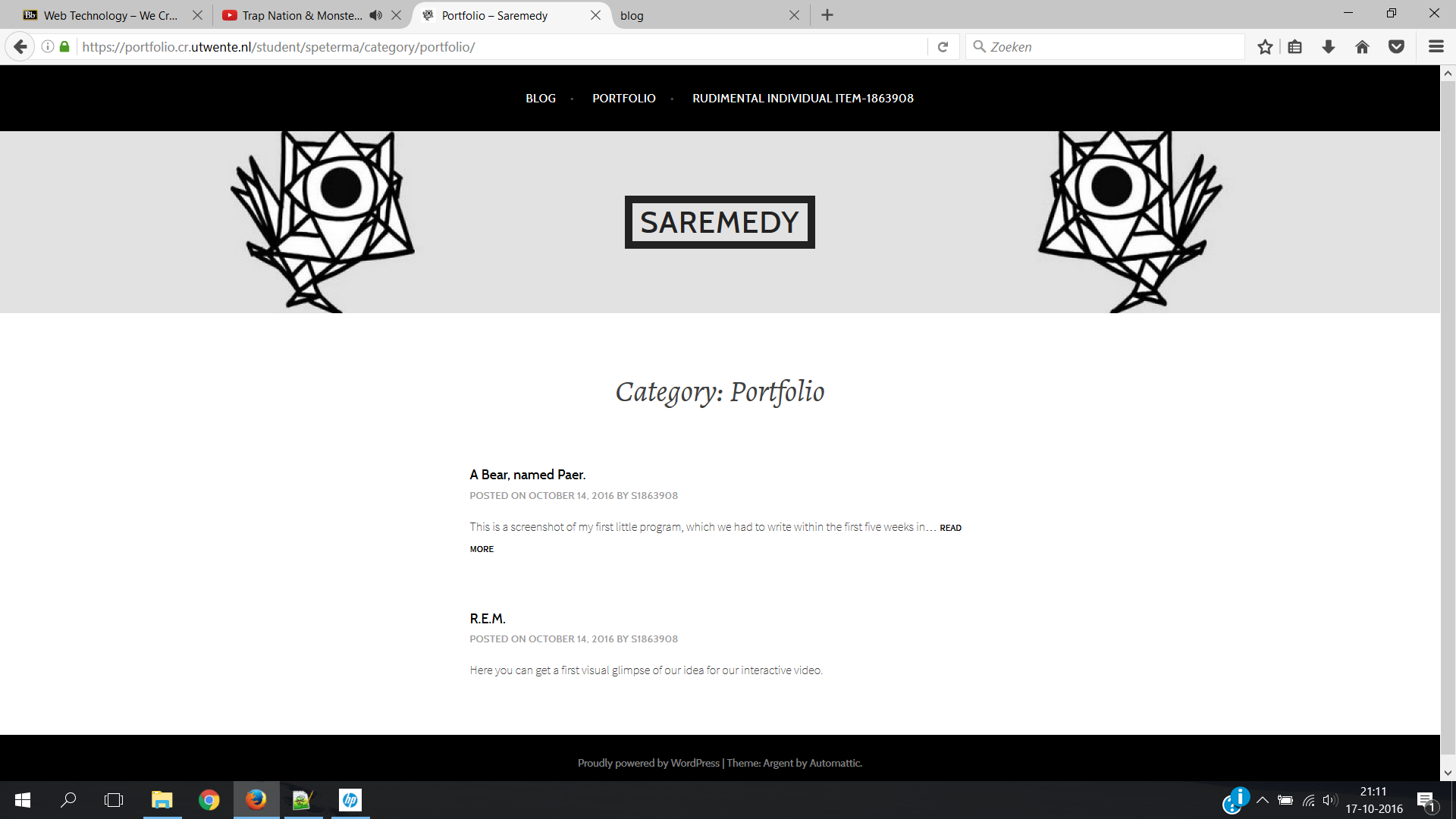 The page consists of four divesion elements. The top is the menu divesion, with a list of all the menu options in it, that can all be accessible by clicking on it (a-function). The second divesion is here name centered and two drawings parrallel to it with a certain margin to the name. The name is also clickable with a link attached to it.
The third divesion is the actual list of portfolio items. This list is also centered and has the name 'Category:Portfolio' with a bigger font on the top. The list had a title, date (which was clickable), studentnumber (also clickable), short description and a text 'READ MORE' which you can click on and that lead you to the actual page of the post. Between the posts was a certain margin.
The fourth divesion consisted of a centered text some wordpress information.
The page consists of four divesion elements. The top is the menu divesion, with a list of all the menu options in it, that can all be accessible by clicking on it (a-function). The second divesion is here name centered and two drawings parrallel to it with a certain margin to the name. The name is also clickable with a link attached to it.
The third divesion is the actual list of portfolio items. This list is also centered and has the name 'Category:Portfolio' with a bigger font on the top. The list had a title, date (which was clickable), studentnumber (also clickable), short description and a text 'READ MORE' which you can click on and that lead you to the actual page of the post. Between the posts was a certain margin.
The fourth divesion consisted of a centered text some wordpress information.
|
|
|
05-10-2016
Website design V3:
This week I started working on the slideshow. I've made good progress with the code to slide between the images, but certain parts of the slideshow were still not the way I wanted them to be, thus the slideshow isn't online yet.
Besides that I've wrote and added a new portfolio page to the website.
The way I've realised my 'personal touch'is by using the hover function a lot. It gives the user the feeling that he can control the website himself, so that he won't get stuck somewhere on the site. The core of the website is the easy menu, which gives a clear overview of what elements the site consists of and here again the hover function. Also part of the core of the website is the articles which are under the menu. That divides the site in to two parts: menu and articles, which makes it easy to browse the site. The articles also have the addition of having a margin around it so that you don't have to overlook the whole screen to read an article.
|
|
|
28-9-2016
Music production (portfolio)
I don't have much content to be shown in my portfolio, but still in order to fill up the portfolio I've included my, still starting, music career.
Recently I've begun with music production with the program FL-studio (also known as Fruity Loops).
 Mastering the program is still quite difficult and to compose a song is more diffucult than I had imagined. Non the less I really enthusiastic to learn the program.
The music genre which has my favor is electronic type of music. I've released my first song, that is based on that genre, recently aswell.
Mastering the program is still quite difficult and to compose a song is more diffucult than I had imagined. Non the less I really enthusiastic to learn the program.
The music genre which has my favor is electronic type of music. I've released my first song, that is based on that genre, recently aswell.
CLICK TO GO TO THE PORTFOLIO PAGE!
|
|
|
27-9-2016
Website design V2:
This week I have made a lot of progress on the design of the site. Every part of the menu has now it own page. Besides that there is now a static frame which contains picture of various sites to contact me (do not work yet). In addition there is now a different background,
because the previous one did not have a high resolution and was not pleasant to look at. 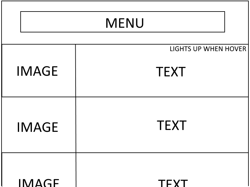
Major change is now the accessibility to the portfolio page, which gives you an overview of the portfolio pieces by having a big bar for side to side with a picture of the project and a short description of it next to that. When you hover over the bar it will light up and when you click every on the bar it will lead you to the page about that piece of the portfolio (check the image for a better visual presentation).
|
|
|
27-9-2016
First piece portfolio!
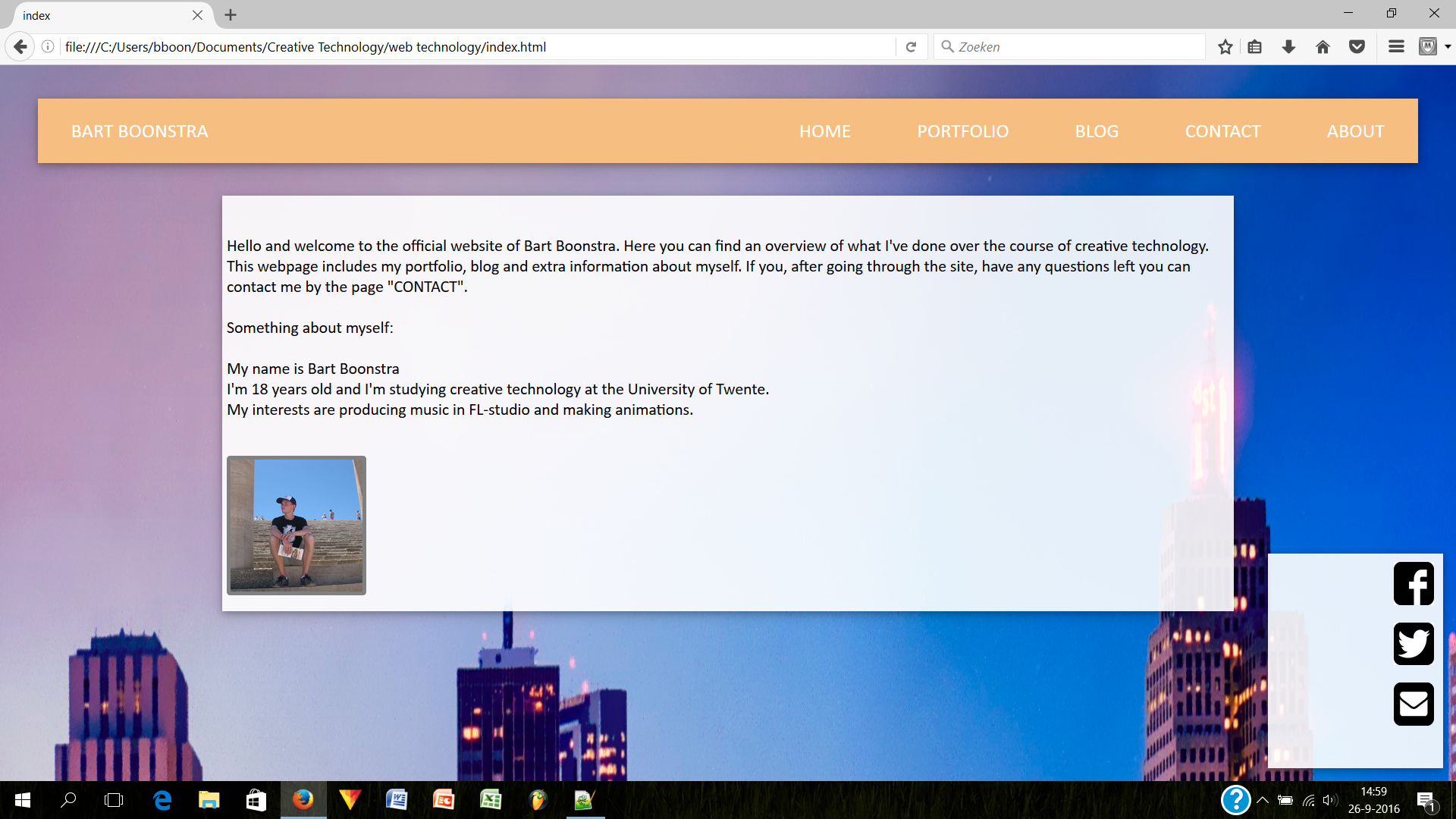
The first piece for my portfolio is online and avaiable for you to watch. It might sound strange, but the first thing to showcase in my portfolio is this website. Since programming is one main core point of Creative Technology, I consider this website itself to be part of my portfolio. The website is currently quite empty but should be update along the course of Creative Technology.
CLICK TO GO TO THE PORTFOLIO PAGE!
|
|
|
18-9-2016
Website design V1:
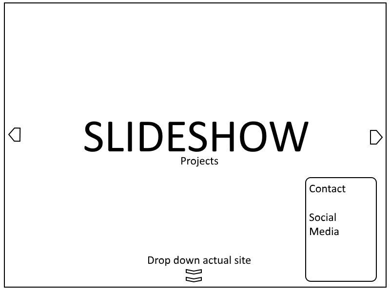 What I have in mind for my website after you open it, is a slideshow of recent projects of my portfolio. This in order to make the viewer aware of what he is seeing. After watching the slides, the viewer can click
a button to dropdown to the actual site. In the site you'll have a horizontal menu containing the pages Home, Portfolio, Blog, About and Contact. All these pages will have the same design, namly the menu up top and text with
pictures in a white transparent table. Next to the table will be a static table that allows the viewer
What I have in mind for my website after you open it, is a slideshow of recent projects of my portfolio. This in order to make the viewer aware of what he is seeing. After watching the slides, the viewer can click
a button to dropdown to the actual site. In the site you'll have a horizontal menu containing the pages Home, Portfolio, Blog, About and Contact. All these pages will have the same design, namly the menu up top and text with
pictures in a white transparent table. Next to the table will be a static table that allows the viewer 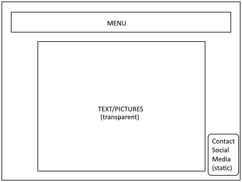 to go to social media pages and contact links. to go to social media pages and contact links.
|