I had to a review of the website of a fellow peer. The website of Alexander Ward got assigned to me. Here is a summary of my review.
Peer review summary:
His website was very clear and minimalistic. I liked his introduction, which makes you want to look at the rest of his website. The consistency between the themes was good as well. The links to the socials were working and clearly visable on his home page. The layout was consistent too but had a different colour per page, which was a nice touch. I commented on that the part about his first few weeks at uni could would fit better as a post on his blog instead of in the about me. The text in his posts was a bit hard to read as well due to the grey colour. It would be more readable if it were darker. I thought his overall website was really nice.
Reflection:
I learnt how to review a website well and also saw which aspects of my website I can better as well. By seeing a website of my peer I also got the motivation to add new things to my website.
Page analysis:
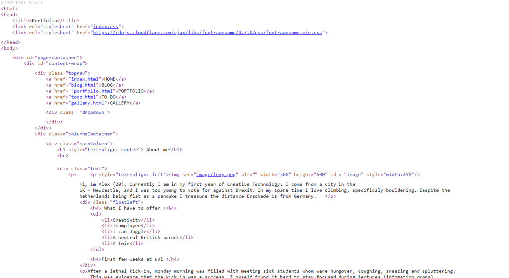
The code written for this website was pretty straight to the point and clean. The CSS was good as well and he made very good use of a variety of things that are possible in CSS.

